11 Data Insights part one
In these last chapters we are concentrating on generating insights into our data using visualisations and descriptive statistics. The easiest way to do this is to use questions as tools to guide your investigation. When you ask a question, the question focuses your attention on a specific part of your dataset and helps you decide which graphs, models, or transformations to make.
For this exercise we will propose that our task is to generate insights into the body mass of our penguins, in order to answer the question
- How is body mass associated with bill length and depth in penguins?
In order to answer this question properly we should first understand our different variables and how they might relate to each other.
- Distribution of data types
- Central tendency
- Relationship between variables
- Confounding variables
This inevitably leads to more and a variety of questions. Each new question that you ask will expose you to a new aspect of your data.
11.0.1 Data wrangling
Importantly you should have already generated an understanding of the variables contained within your dataset during the data wrangling steps. Including:
The number of variables
The data format of each variable
Checked for missing data
Checked for typos, duplications or other data errors
Cleaned column or factor names
It is very important to not lose site of the questions you are asking
You should also play close attention to the data, and remind yourself frequently how many variables do you have and what are their names?
How many rows/observations do you have?
Pay close attention to the outputs, errors and warnings from the R console.
11.1 Variable types
A quick refresher:
11.1.1 Numerical
You should already be familiar with the concepts of numerical and categorical data. Numeric variables have values that describe a measure or quantity. This is also known as quantitative data. We can subdivide numerical data further:
- Continuous numeric variables. This is where observations can take any value within a range of numbers. Examples might include body mass (g), age, temperature or flipper length (mm). While in theory these values can have any numbers, within a dataset they are likely bounded (set within a minimum/maximum of observed or measurable values), and the accuracy may only be as precise as the measurement protocol allows.
In a tibble these will be represented by the header <dbl>.
- Discrete numeric variables Observations are numeric but restricted to whole values e.g. 1,2,3,4,5 etc. These are also known as integers. Discrete variables could include the number of individuals in a population, number of eggs laid etc. Anything where it would make no sense to describe in fractions e.g. a penguin cannot lay 2 and a half eggs. Counting!
In a tibble these will be represented by the header <int>.
11.1.2 Categorical
Values that describe a characteristic of data such as 'what type' or 'which category'. Categorical variables are mutually exclusive - one observation should not be able to fall into two categories at once - and should be exhaustive - there should not be data which does not fit a category (not the same as NA - not recorded). Categorical variables are qualitative, and often represented by non-numeric values such as words. It's a bad idea to represent categorical variables as numbers (R won't treat it correctly). Categorical variables can be defined further as:
Nominal variables Observations that can take values that are not logically ordered. Examples include Species or Sex in the Penguins data. In a tibble these will be represented by the header
<chr>.Ordinal variables Observations can take values that can be logically ordered or ranked. Examples include - activity levels (sedentary, moderately active, very active); size classes (small, medium, large).
These will have to be coded manually see Factors, and will then be represented in a tibble by the header <fct>
It is important to order Ordinal variables in the their logical order value when plotting data visuals or tables. Nominal variables are more flexible and could be ordered in whatever pattern works best for your data ( by default they will plot alphabetically, but perhaps you could order them according to the values of another numeric variable).
11.2 Quick view of variables
Let's take a look at some of our variables, these functions will give a quick snapshot overview.
We can see that bill length contains numbers, and that many of these are fractions, but only down to 0.1mm. By comparison body mass all appear to be discrete number variables. Does this make body mass an integer? The underlying quantity (bodyweight) is clearly continuous, it is clearly possible for a penguin to weigh 3330.7g but it might look like an integer because of the way it was measured. This illustrates the importance of understanding the the type of variable you are working with - just looking at the values isn't enough.
On the other hand, how we choose to measure and record data can change the way it is presented in a dataset. If the researchers had decided to simply record small, medium and large classes of bodyweight, then we would be dealing with ordinal categorical variables (factors). These distinctions can become less clear if we start to deal with multiple classes of ordinal categories - for example if the researchers were measuring body mass to the nearest 10g. It might be reasonable to treat these as integers...
11.3 Categorical variables
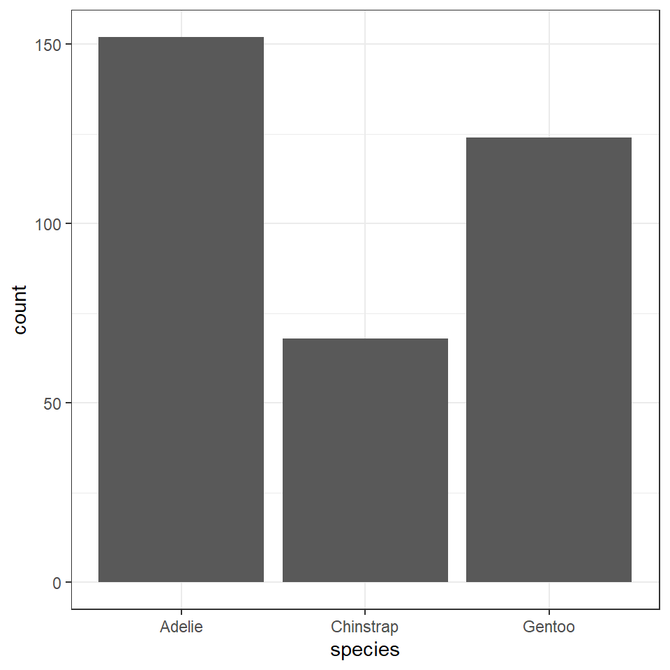
11.3.1 Frequency
| species | n |
|---|---|
| Adelie | 152 |
| Chinstrap | 68 |
| Gentoo | 124 |
It might be useful for us to make some quick data summaries here, like relative frequency
prob_obs_species <- penguins %>%
  group_by(species) %>%
  summarise(n = n()) %>%
  mutate(prob_obs = n/sum(n))

prob_obs_species| species | n | prob_obs |
|---|---|---|
| Adelie | 152 | 0.4418605 |
| Chinstrap | 68 | 0.1976744 |
| Gentoo | 124 | 0.3604651 |
So about 44% of our sample is made up of observations from Adelie penguins. When it comes to making summaries about categorical data, that's about the best we can do, we can make observations about the most common categorical observations, and the relative proportions.
This chart is ok - but can we make anything better?
We could go for a stacked bar approach
penguins %>%
  ggplot(aes(x="",
             fill=species))+
  # specify fill = species to ensure colours are defined by species
  geom_bar(position="fill")+
  # specify fill forces geom_bar to calculate percentages
  scale_y_continuous(labels=scales::percent)+
  #use scales package to turn y axis into percentages easily
  labs(x="",
       y="")+
  theme_minimal()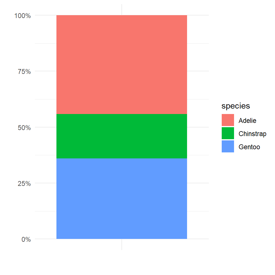
This graph is OK but not great, the height of each section of the bar represents the relative proportions of each species in the dataset, but this type of chart becomes increasingly difficult to read as more categories are included. Colours become increasingly samey,and it is difficult to read where on the y-axis a category starts and stops, you then have to do some subtraction to work out the values.
The best graph is then probably the first one we made - with a few minor tweak we can rapidly improve this.
penguins %>%
  mutate(species=factor(species, levels=c("Adelie",
                                          "Gentoo",
                                          "Chinstrap"))) %>%
  # set as factor and provide levels
  ggplot()+
  geom_bar(aes(x=species),
           fill="steelblue",
           width=0.8)+
  labs(x="Species",
       y = "Number of observations")+
  geom_text(data=prob_obs_species,
            aes(y=(n+10),
                x=species,
                label=scales::percent(prob_obs)))+
  coord_flip()+
  theme_minimal()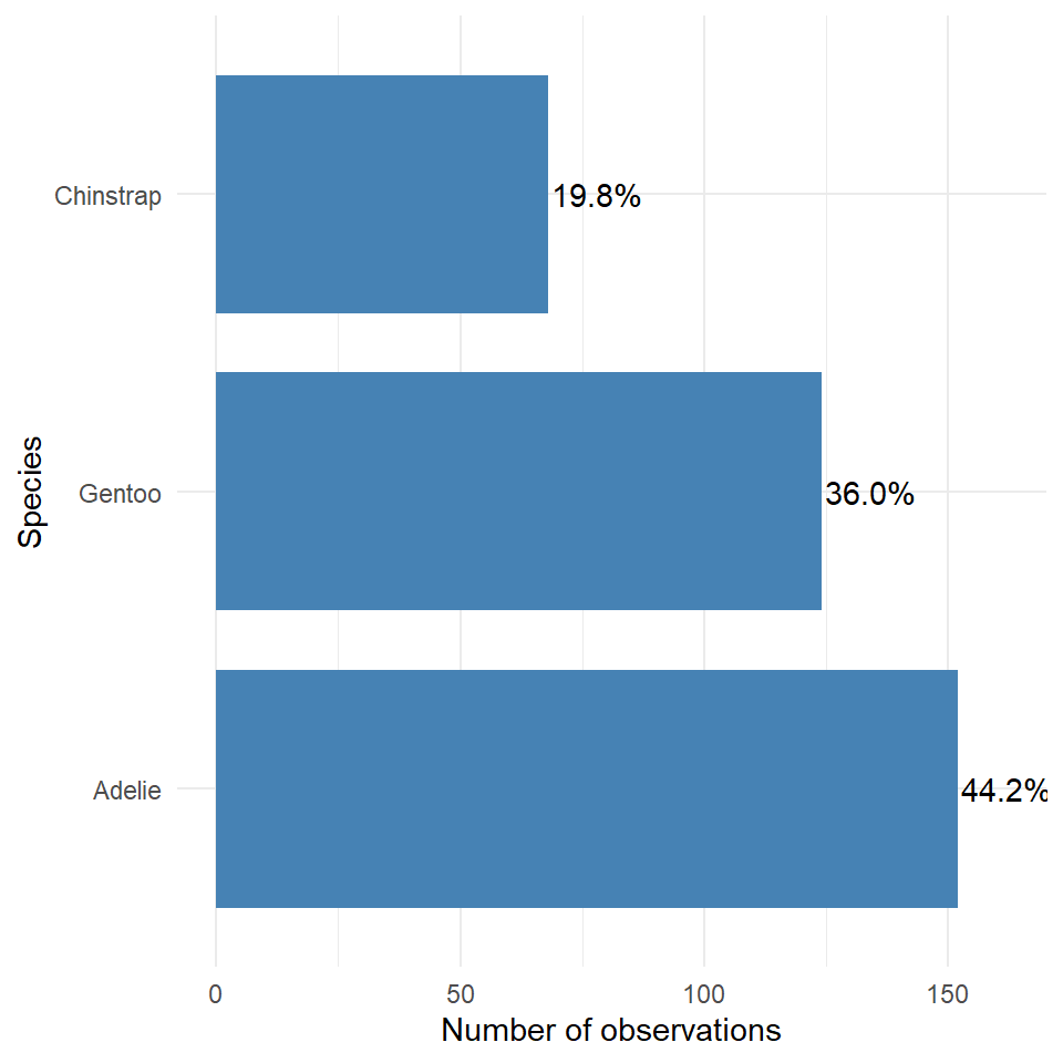
This is an example of a figure we might use in a report or paper. Having cleaned up the theme, added some simple colour, made sure our labels are clear and descriptive, ordered our categories in ascending frequency order, and included some simple text of percentages to aid readability.
11.3.2 Two categorical variables
Understanding how frequency is broken down by species and sex might be useful information to have.
| species | sex | n | prob_obs |
|---|---|---|---|
| Adelie | FEMALE | 73 | 0.4802632 |
| Adelie | MALE | 73 | 0.4802632 |
| Adelie | NA | 6 | 0.0394737 |
| Chinstrap | FEMALE | 34 | 0.5000000 |
| Chinstrap | MALE | 34 | 0.5000000 |
| Gentoo | FEMALE | 58 | 0.4677419 |
| Gentoo | MALE | 61 | 0.4919355 |
| Gentoo | NA | 5 | 0.0403226 |
11.4 Continuous variables
11.4.1 Visualising distributions
Variation is the tendency of the values of a variable to change from measurement to measurement. You can see variation easily in real life; if you measure any continuous variable twice, you will get two different results. This is true even if you measure quantities that are constant, like the speed of light. Each of your measurements will include a small amount of error that varies from measurement to measurement. Every variable has its own pattern of variation, which can reveal interesting information. The best way to understand that pattern is to visualise the distribution of the variable’s values.
This is the script to plot a frequency distribution, we only specify an x variable, because we intend to plot a histogram, and the y variable is always the count of observations. Here we ask the data to be presented in 10 equally sized bins of data. In this case chopping the x axis range into 10 equal parts and counting the number of observations that fall within each one.
penguins %>%
  ggplot()+
  geom_histogram(aes(x=body_mass_g),
                 bins=10)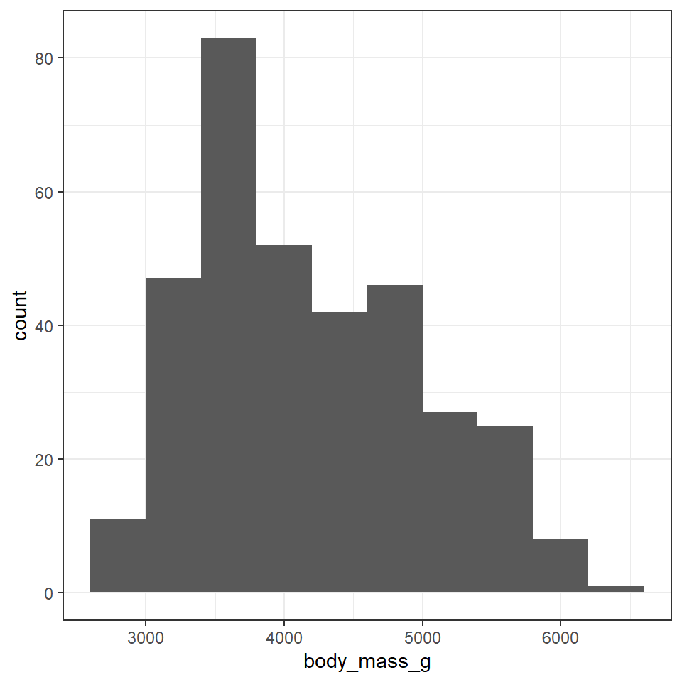
Change the value specified to the bins argument and observe how the figure changes. It is usually a very good idea to try more than one set of bins in order to have better insights into the data
To get the most out of your data, combine data you collected from the summary() function and the histogram here
Which values are the most common?
Which values are rare? Why? Does that match your expectations?
Can you see any unusual patterns?
How many observations are missing body mass information?
11.4.1.1 Atypical values
If you found atypical values at this point, you could decide to exclude them from the dataset (using filter()). BUT you should only do this at this stage if you have a very strong reason for believing this is a mistake in the data entry, rather than a true outlier.
11.4.2 Central tendency
Central tendency is a descriptive summary of a dataset through a single value that reflects the center of the data distribution. The three most widely used measures of central tendency are mean, median and mode.
The mean is defined as the sum of all values of the variable divided by the total number of values. The median is the middle value. If N is odd and if N is even, it is the average of the two middle values. The mode is the most frequently occurring observation in a data set, but is arguable least useful for understanding biological datasets.
We can find both the mean and median easily with the summarise function. The mean is usually the best measure of central tendency when the distribution is symmetrical, and the mode is the best measure when the distribution is asymmetrical/skewed.
penguin_body_mass_summary <- penguins %>%
    summarise(mean_body_mass=mean(body_mass_g, na.rm=T),
              sd = sd(body_mass_g, na.rm = T),
              median_body_mass=median(body_mass_g, na.rm=T),
              iqr = IQR(body_mass_g, na.rm = T))

penguin_body_mass_summary| mean_body_mass | sd | median_body_mass | iqr |
|---|---|---|---|
| 4201.754 | 801.9545 | 4050 | 1200 |
penguins %>%
ggplot()+
  geom_histogram(aes(x=body_mass_g),
               alpha=0.8,
               bins = 10,
               fill="steelblue",
               colour="darkgrey")+
   geom_vline(data=penguin_body_mass_summary,
             aes(xintercept=mean_body_mass),
             colour="red",
             linetype="dashed")+
     geom_vline(data=penguin_body_mass_summary,
             aes(xintercept=median_body_mass),
             colour="black",
             linetype="dashed")+
  labs(x = "Body mass (g)",
       y = "Count")+
  theme_classic()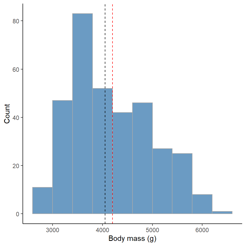
Figure 11.1: Red dashed line represents the mean, Black dashed line is the median value
11.4.3 Normal distribution
From our histogram we can likely already tell whether we have normally distributed data.
Normal distribution, also known as the "Gaussian distribution", is a probability distribution that is symmetric about the mean, showing that data near the mean are more frequent in occurrence than data far from the mean. In graphical form, the normal distribution appears as a "bell curve".
If our data follows a normal distribution, then we can predict the spread of our data, and the likelihood of observing a datapoint of any given value with only the mean and standard deviation.
Here we can simulate what a normally distributed dataset would look like with our sample size, mean and standard deviation.
norm_mass <- rnorm(n = 344,
      mean = 4201.754,
      sd = 801.9545) %>%
  as_tibble()

norm_mass %>%
  as_tibble() %>%
  ggplot()+
  geom_histogram(aes(x = value),
                 bins = 10)
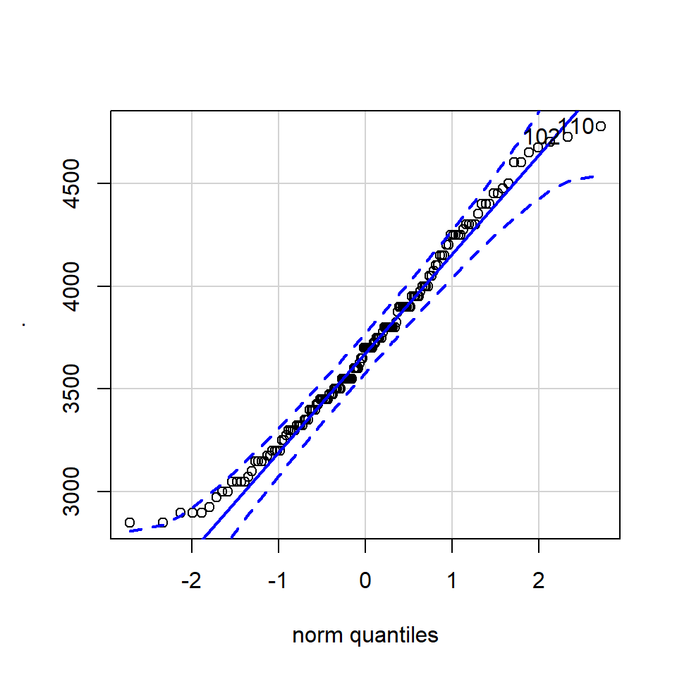
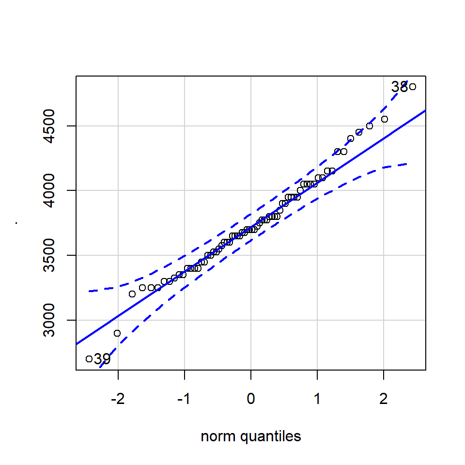
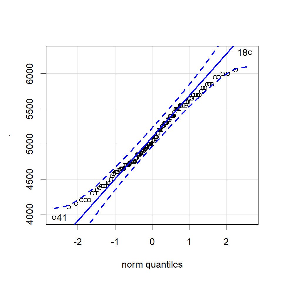
11.4.3.1 QQ-plot
A QQ plot is a classic way of checking whether a sample distribution is the same as another (or theoretical distribution). They look a bit odd at first, but they are actually fairly easy to understand, and very useful! The qqplot distributes your data on the y-axis, and a theoretical normal distribution on the x-axis. If the residuals follow a normal distribution, they should meet to produce a perfect diagonal line across the plot.
Watch this video to see QQ plots explained
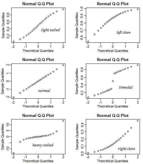
Figure 11.2: Examples of qqplots with different deviations from a normal distribution
In our example we can see that most of our residuals can be explained by a normal distribution, except at the low end of our data.
So the fit is not perfect, but it is also not terrible!
ggplot(penguins, aes(sample = body_mass_g))+
  stat_qq() +
  stat_qq_line()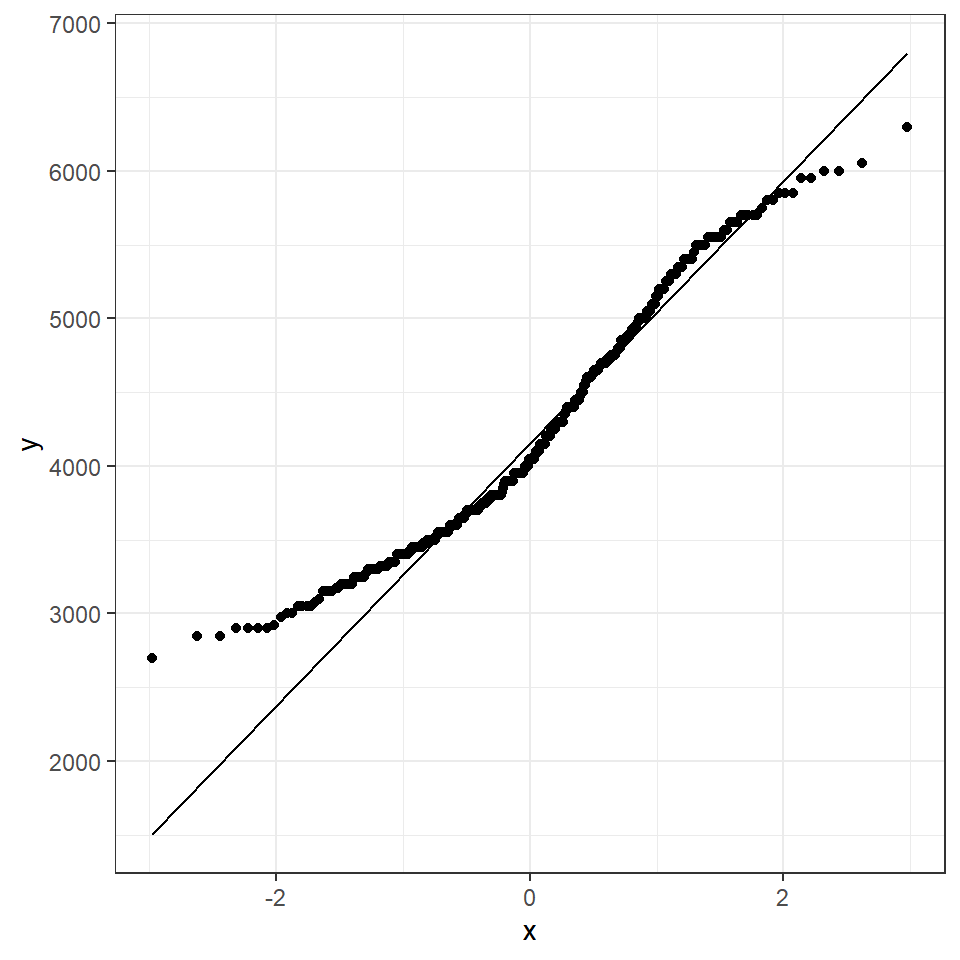
How do we know how much deviation from an idealised distribution is ok?
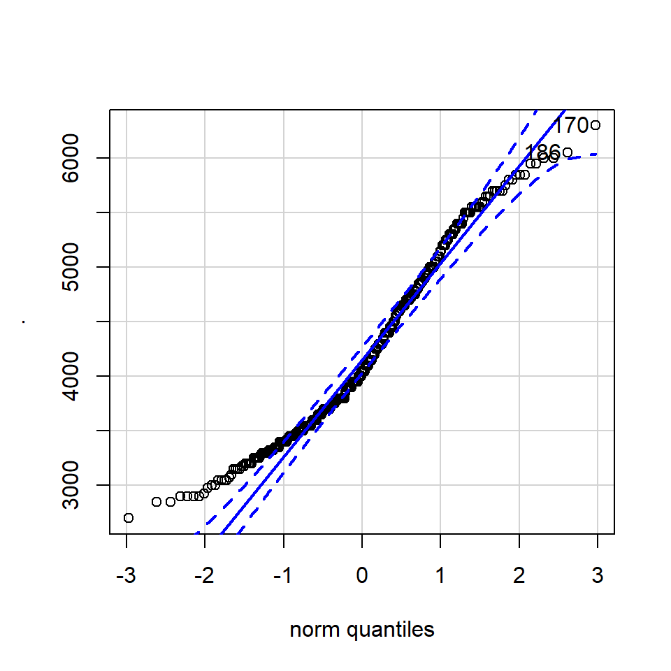
## [1] 170 186The qqPlot() function from the R package car provides 95% confidence interval margins to help you determine how severely your quantiles deviate from your idealised distribution.
With the information from the qqPlot which section of the distribution deviates most clearly from a normal distribution
11.4.4 Variation
Dispersion (how spread out the data is) is an important component towards understanding any numeric variable. While measures of central tendency are used to estimate the central value of a dataset, measures of dispersion are important for describing the spread of data.
Two data sets can have an equal mean (that is, measure of central tendency) but vastly different variability.
Important measures for dispersion are range, interquartile range, variance and standard deviation.
The range is defined as the difference between the highest and lowest values in a dataset. The disadvantage of defining range as a measure of dispersion is that it does not take into account all values for calculation.
The interquartile range is defined as the difference between the third quartile denoted by 𝑸_𝟑 and the lower quartile denoted by 𝑸_𝟏 . 75% of observations lie below the third quartile and 25% of observations lie below the first quartile.
Variance is defined as the sum of squares of deviations from the mean, divided by the total number of observations. The standard deviation is the positive square root of the variance. The standard deviation is preferred instead of variance as it has the same units as the original values.
11.4.4.1 Interquartile range
We used the IQR function in summarise() to find the interquartile range of the body mass variable.
The IQR is also useful when applied to the summary plots 'box and whisker plots'. We can also calculate the values of the IQR margins, and add labels with scales Wickham & Seidel (2020).
penguins %>%
  summarise(q_body_mass = quantile(body_mass_g, c(0.25, 0.5, 0.75), na.rm=TRUE),
quantile = scales::percent(c(0.25, 0.5, 0.75))) # scales package allows easy converting from data values to perceptual properties| q_body_mass | quantile |
|---|---|
| 3550 | 25% |
| 4050 | 50% |
| 4750 | 75% |
We can see for ourselves the IQR is obtained by subtracting the body mass at tht 75% quantile from the 25% quantile (4750-3550 = 1200).
11.4.4.2 Standard deviation
standard deviation (or \(s\)) is a measure of how dispersed the data is in relation to the mean. Low standard deviation means data are clustered around the mean, and high standard deviation indicates data are more spread out. As such it makes sense only to use this when the mean is a good measure of our central tendency.
\(\sigma\) = a known population standard deviation
\(s\) = a sample standard deviation
summarise() to quickly produce a mean and standard deviation.
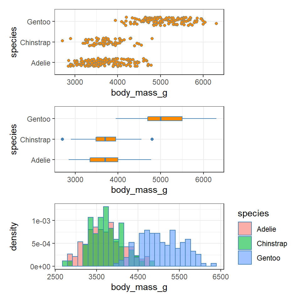
11.4.5 Visualising dispersion
Figure 11.3: Visualising dispersion with different figures
colour_fill <- "darkorange"
colour_line <- "steelblue"
lims <- c(0,7000)

body_weight_plot <- function(){

  penguins %>%
  ggplot(aes(x="",
             y= body_mass_g))+
  labs(x= " ",
       y = "Mass (g)")+
  scale_y_continuous(limits = lims)+
    theme_minimal()
}

plot_1 <- body_weight_plot()+
  geom_jitter(fill = colour_fill,
               colour = colour_line,
               width = 0.2,
              shape = 21)

plot_2 <- body_weight_plot()+
  geom_boxplot(fill = colour_fill,
               colour = colour_line,
               width = 0.4)

plot_3 <- penguin_body_mass_summary %>%
  ggplot(aes(x = " ",
             y = mean_body_mass))+
  geom_bar(stat = "identity",
           fill = colour_fill,
           colour = colour_line,
               width = 0.2)+
  geom_errorbar(data = penguin_body_mass_summary,
                aes(ymin = mean_body_mass - sd,
                    ymax = mean_body_mass + sd),
                colour = colour_line,
                width = 0.1)+
  labs(x = " ",
       y = "Body mass (g)")+
  scale_y_continuous(limits = lims)+
  theme_minimal()


plot_1 + plot_2 + plot_3 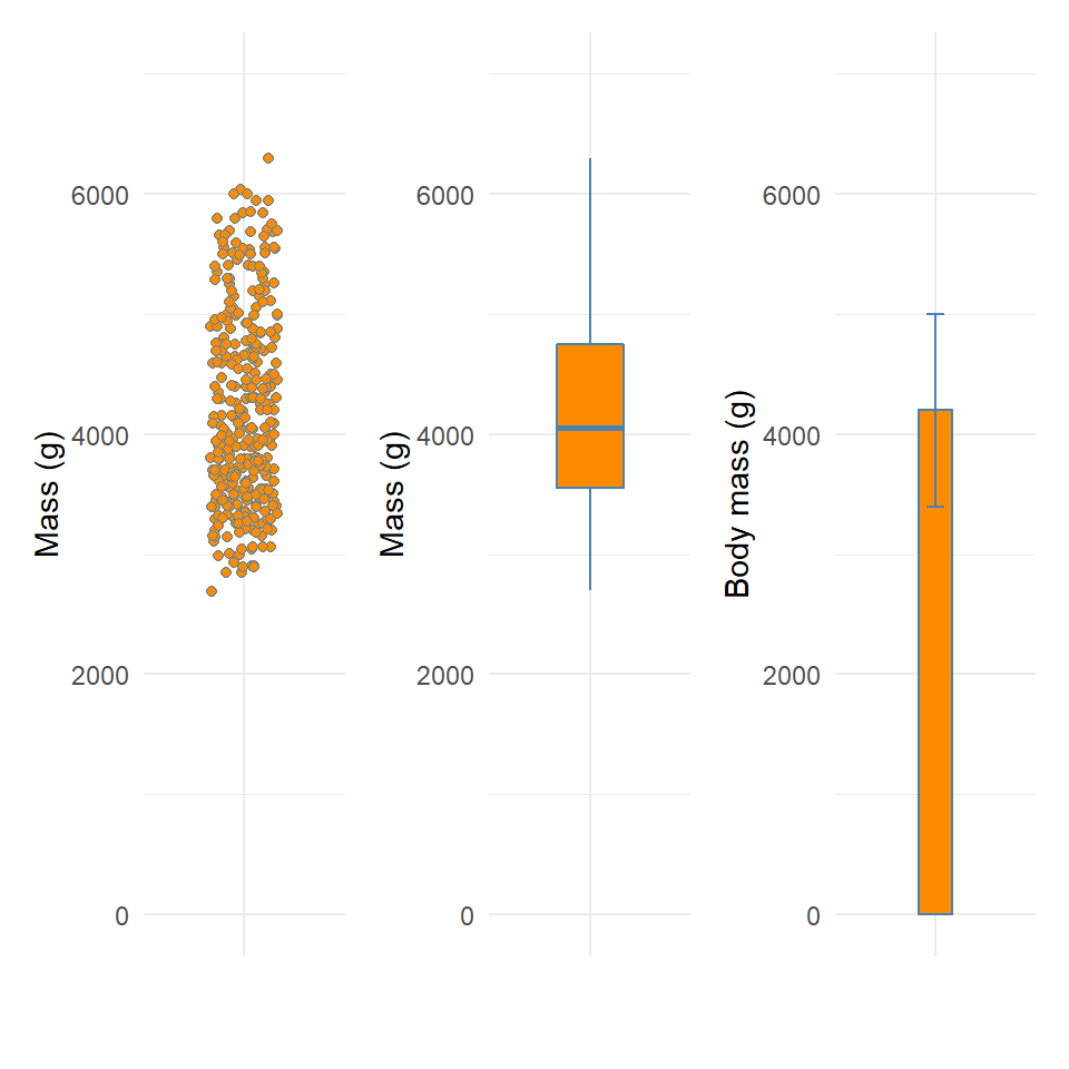
We now have several compact representations of the body_mass_g including a histogram, boxplot and summary calculations. You can and should generate the same summaries for your other numeric variables. These tables and graphs provide the detail you need to understand the central tendency and dispersion of numeric variables.
11.4.6 drop_na
We first met NA back in Chapter 4 and you will hopefully have noticed, either here or in those previous chapters, that missing values NA can really mess up our calculations. There are a few different ways we can deal with missing data:
drop_na()on everything before we start. This runs the risk that we lose a lot of data as every row, with an NA in any column will be removeddrop_na()on a particular variable. This is fine, but we should approach this cautiously - if we do this in a way where we write this data into a new object e.g.penguins <- penguins %>% drop_na(body_mass_g)then we have removed this data forever - perhaps we only want to drop those rows for a specific calculation - again they might contain useful information in other variables.drop_na()for a specific task - this is a more cautious approach but we need to be aware of another phenomena. Is the data missing at random? You might need to investigate where your missing values are in a dataset. Data that is truly missing at random can be removed from a dataset without introducing bias. However, if bad weather conditions meant that researchers could not get to a particular island to measure one set of penguins that data is missing not at random this should be treated with caution. If that island contained one particular species of penguin, it might mean we have complete data for only two out of three penguin species. There is nothing you can do about incomplete data other than be aware that data not missing at random could influence your distributions.
11.5 Categorical and continuous variables
It’s common to want to explore the distribution of a continuous variable broken down by a categorical variable.
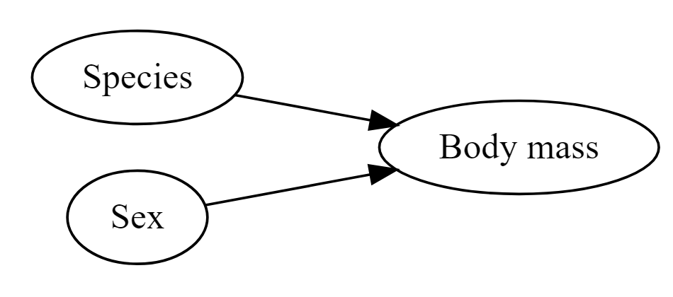
Figure 11.4: Species and sex are both likely to affect body mass
So it is reasonable to think that perhaps either species or sex might affect the morphology of beaks directly - or that these might affect body mass (so that if there is a direct relationship between mass and beak length, there will also be an indirect relationship with sex or species).
The best and simplest place to start exploring these possible relationships is by producing simple figures.
Let's start by looking at the distribution of body mass by species.
11.6 Activity 1: Produce a plot which allows you to look at the distribution of penguin body mass observations by species
11.7 GGridges
The package ggridges (Wilke (2021)) provides some excellent extra geoms to supplement ggplot. One if its most useful features is to to allow different groups to be mapped to the y axis, so that histograms are more easily viewed.
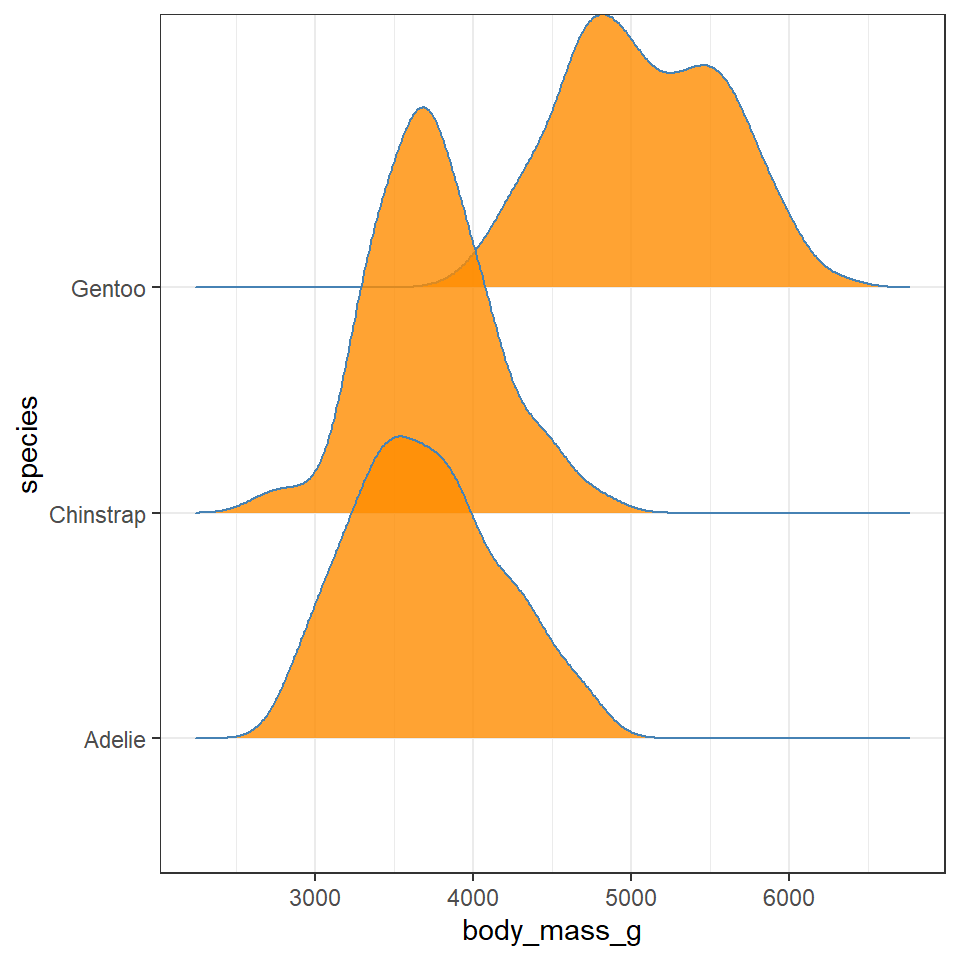
Q. Does each species have a data distribution that appears to be normally distributed?
Gentoo
Chinstrap
Adelie
penguins %>% drop_na %>% ggplot(aes(x = body_mass_g, y = species)) +
    geom_density_ridges(aes(fill = sex),
                        colour = colour_line,
                        alpha = 0.8,
                        bandwidth = 175)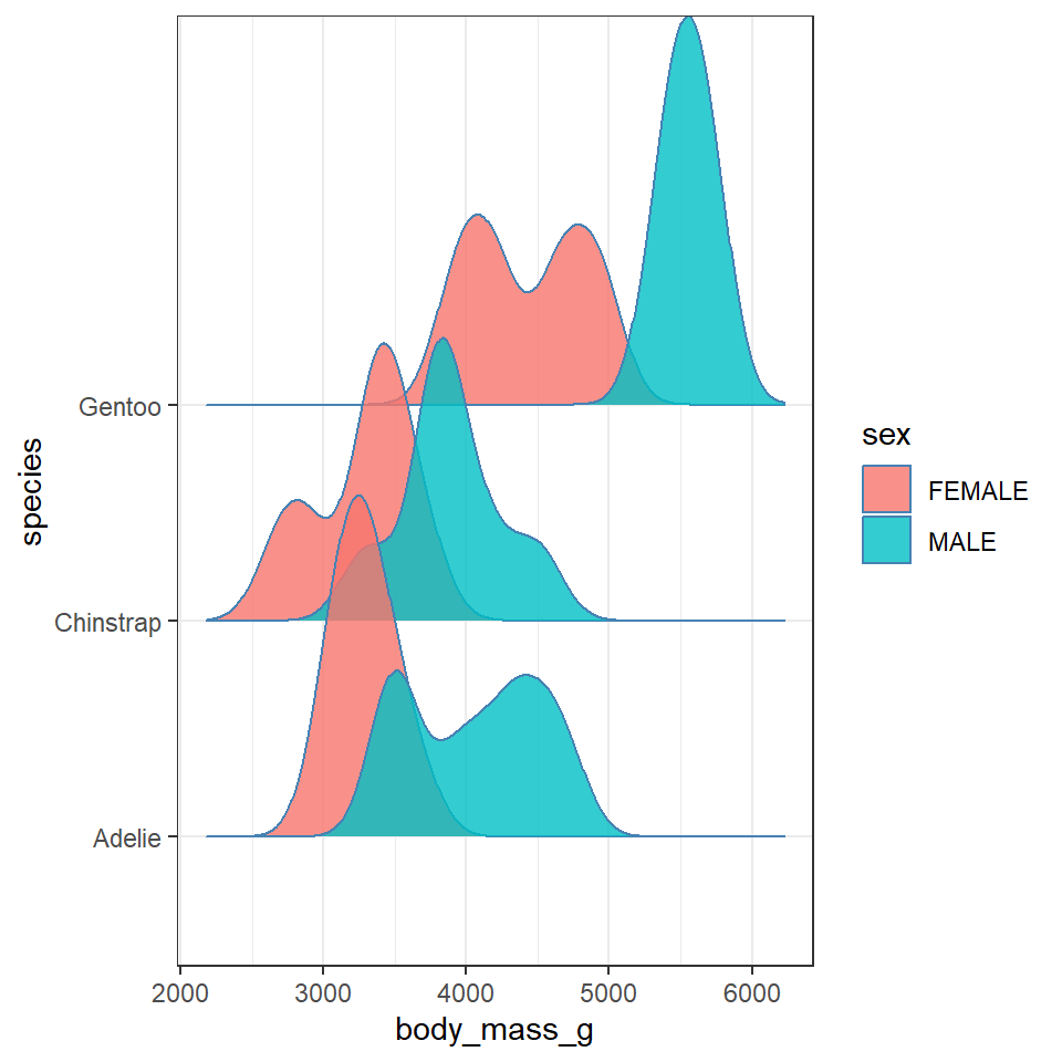
# try playing with the bandwidth argument - this behaves similar to binning which you should be familiar with from using geom_histogram11.8 Activity 2: Test yourself
Question 1. Write down some insights you have made about the data and relationships you have observed. Compare these to the ones below. Do you agree with these? Did you miss any? What observations did you make that are not in the list below.
This is revealing some really interesting insights into the shape and distribution of body sizes in our penguin populations now.
For example:
Gentoo penguins appear to show strong sexual dimorphism with almost all males being larger than females (little overlap on density curves).
Gentoo males and females are on average larger than the other two penguin species
Gentoo females have two distinct peaks of body mass.
Chinstrap penguins also show evidence of sexual dimorphism, though with greater overlap.
Adelie penguins have larger males than females on average, but a wide spread of male body mass, (possibly two groups?)
Note how we are able to understand our data better, by spending time making data visuals. While descriptive data statistics (mean, median) and measures of variance (range, IQR, sd) are important. They are not substitutes for spending time thinking about data and making exploratory analyses.
Question 2. Using summarise we can quickly calculate \(s\) but can you replicate this by hand with dplyr functions? - do this for total \(s\) (not by category).
Residuals
Squared residuals
Sum of squares
Variance = SS/df
\(s=\sqrt{Variance}\)