penguins |>
  summarise(                        # calculate summary statistics
    n = n(),                        # count of observations (sample size)
    mean = mean(culmen_length_mm,   # average culmen length, ignoring missing values
                na.rm = TRUE),
    median = median(culmen_length_mm,
                   na.rm = TRUE),   # middle value of culmen length
    sd = sd(culmen_length_mm,
            na.rm = TRUE),          # standard deviation (spread around the mean)
    iqr = IQR(culmen_length_mm,
              na.rm = TRUE),        # interquartile range (spread of middle 50%)
    .groups = "drop"
)5 Data insights
For this exercise, we propose that our task is to generate insights into the relationship between bill (culmen) length and bill (culmen) depth in penguins. Our goal is to answer the question: Is there a meaningful relationship between these two measurements? Understanding this relationship can provide valuable insights into the physical characteristics of different penguin species and how they may vary.
Important
You should be working in the script you made in the last session check it contains everything contained in {Section 3.6.1} and runs cleanly (no errors).
Test this by making sure you have set your project up correctly (see {Section B.2}), restart your R session, and run your current script.
NoteQuick Recap
Previously you: 1. Imported data (readRDS(), read_csv()), saved intermediate objects. 2. Cleaned names (janitor::clean_names()), checked types (glimpse() / skimr::skim()). 3. Identified missing values, duplicates, inconsistent factor levels. 4. Used grouping (dplyr) to summarise. 5. Saved a reusable script.
Today we build forward — we assume basic cleaning is done.
ImportantToday’s Workflow
summarise → visualise → think causally
- Summarise: Get core descriptive statistics (center, spread, counts).
- Visualise: Use multiple plot types to expose structure and anomalies.
- Think causally: Ask whether patterns could be explained by grouping variables (e.g. species), and avoid misleading pooled summaries.
5.1 Understanding the Variables
Our key variables are:
Culmen Length (bill length): This measures the length of the penguin’s bill, an important feature related to feeding.
Culmen Depth (bill depth): This measures the thickness of the penguin’s bill.
We will also routinely consider: Species, Sex, Island, Year, Flipper length(mm) and Body Mass (g).
5.2 What should we consider in our analysis?
5.2.1 Data Types
Bill length and depth: continuous numerical.
Species, sex, island, year: categorical (year is numeric but often used as a factor in exploratory stratification).
NoteWhy this matters:
Knowing whether a variable is numerical or categorical will influence how we visualize it and which statistical methods we use. For instance, numerical data might be plotted using histograms, while categorical data could be displayed using bar charts or boxplots.
5.2.2 Central Tendency & Variation
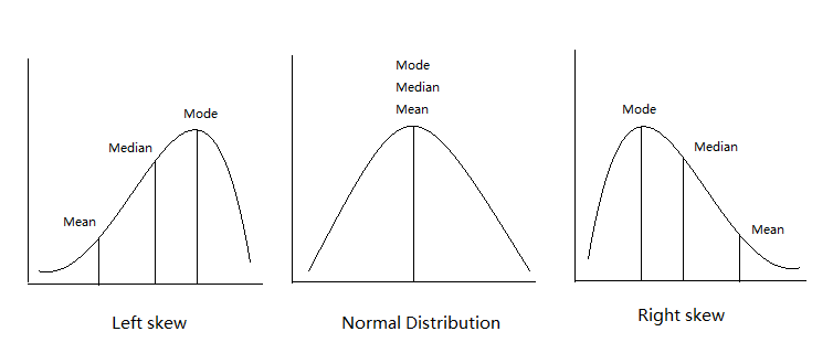
Next, we’ll want to understand the central tendency of our data. Central tendency refers to the average or most common values in a dataset:
Mean: The average value (sum of all values divided by the number of values).
Median: The middle value when data is sorted from lowest to highest, which is especially useful if the data is skewed or contains outliers.
Mode: The most frequently occurring value in the dataset (not always relevant for continuous data).
NoteWhy this matters:
Understanding the average bill length and depth helps us get a sense of what is “normal” for our penguins. Additionally, comparing these statistics across different species or islands could reveal differences in penguin populations.
5.2.3 Relationships
Now, we dive into the heart of our analysis: exploring the relationship between culmen length and culmen depth. To investigate this, we can use visual tools like scatterplotsA graph that displays the relationship between two numerical variables by plotting data points on an X and Y axis. , which allow us to plot one variable against the other and visually check for patterns or trends.
We might also want to calculate a correlation coefficientA numerical value ranging from -1 to 1 that measures the strength and direction of the linear relationship between two variables. to quantify the strength of the relationship between bill length and bill depth. If we find a strong correlation, we can say that these two measurements tend to move together — for example, as the bill length increases, so might the bill depth.
NoteWhy this matters:
Identifying the relationship between variables is critical to making meaningful conclusions. If bill length and depth are highly correlated, we can begin to explore why this might be the case — perhaps certain penguin species have distinct bill shapes that differ from others.
5.2.4 Confounding Variables
A confounding variableA variable that affects both the independent and dependent variables, potentially distorting the observed relationship between them. influences both variables in a relationship (e.g. species affects both length and depth). Ignoring it can distort or reverse observed trends
NoteWhy this matters:
Ignoring confounding variables could lead us to incorrect conclusions. For instance, if we see a strong relationship between bill length and depth, it could simply be due to species differences, rather than a true relationship across all penguins.
5.2.5 Asking New Questions
Every step of the analysis leads to new questions. This is a natural part of the data exploration process (e.g. “Is this consistent across species?”)
5.2.6 Data Checking (Recap)
Already completed in {Chapter 3} a reminder why it matters:
Confirm variable formats.
Locate & classify missingness.
Count observations per key groups to assess balance.
Ensure cleaned, informative names (see {Section C.7})
5.3 Activity: Quick Descriptive Summaries
We’ll start with descriptive statistics—numerical summaries that describe the main features of a dataset.
For a single variable (here: “culmen length in mm”), the most common statistics are:
| Statistic | What it tells us |
|---|---|
| n | Sample size (how many penguins are included) |
| Mean | The average value |
| Median | The “middle” value (half above, half below) |
| SD | Standard deviation = typical distance from the mean |
| IQR | Interquartile range = spread of the middle 50% |
| Min/Max | Smallest and largest values (range) |
Think of mean/median as center, and SD/IQR/min/max as spread.
Check out StatQuest for some great explainer/recap videos.
5.3.1 Overall distribution
What does the culmen length look like across all penguins?
5.3.2 By species
Do species differ in average culmen length or variability?
penguins |>
  group_by(species) |>         # split the data into subgroups by species
  summarise(                  # within each subgroup, calculate summary statistics
    n = n(),
    mean = mean(culmen_length_mm, na.rm = TRUE),
    median = median(culmen_length_mm, na.rm = TRUE),
    sd = sd(culmen_length_mm, na.rm = TRUE),
    iqr = IQR(culmen_length_mm, na.rm = TRUE),
    .groups = "drop"           # remove grouping in the final output
  )
NoteStop & Reflect
How do the species means compare to the overall mean?
Why might it be misleading to report only the overall mean without looking at subgroups?
Why is species a useful/informative choice to split data by?
Could other variables also affect culmen length?
Species vs. overall mean → The species means are quite different from each other; the overall mean blends them together and hides those differences.
Why overall mean can mislead → If we only reported the overall mean, we’d miss meaningful biological variation according to important subgroups.
Why species is useful → Biology suggests species differ systematically in body size and morphology, so species plausibly causes variation in culmen length.
Other variables → Yes - sex (sexual dimorphism): males and females can often have different average body size - island: possible if they experience very different environmental conditions - year: possible if they experience different environmental conditions - body mass: possible - but body mass could also be indirectly affected by species or environment
5.3.3 By species and sex
Do males and females within a species look different? Which subgroups are most variable?
penguins |>
  group_by(species, sex) |>         # split the data into subgroups by species AND sex
  summarise(                        # within each subgroup, calculate summary statistics
    n = n(),
    mean = mean(culmen_length_mm,
                na.rm = TRUE),
    median = median(culmen_length_mm,
                   na.rm = TRUE),
    sd = sd(culmen_length_mm,
            na.rm = TRUE),
    iqr = IQR(culmen_length_mm,
              na.rm = TRUE),
    .groups = "drop"                # remove grouping in the final output
)| species | sex | n | mean | median | sd | iqr |
|---|---|---|---|---|---|---|
| Adelie | Female | 73 | 37.25753 | 37.00 | 2.028883 | 2.900 |
| Adelie | Male | 73 | 40.39041 | 40.60 | 2.277131 | 2.500 |
| Adelie | NA | 6 | 37.84000 | 37.80 | 2.802320 | 0.300 |
| Chinstrap | Female | 34 | 46.57353 | 46.30 | 3.108669 | 1.950 |
| Chinstrap | Male | 34 | 51.09412 | 50.95 | 1.564558 | 1.925 |
| Gentoo | Female | 58 | 45.56379 | 45.50 | 2.051247 | 3.025 |
| Gentoo | Male | 61 | 49.47377 | 49.50 | 2.720594 | 2.400 |
| Gentoo | NA | 5 | 45.62500 | 45.35 | 1.374470 | 1.975 |
NoteStop & Reflect
Which species + sex subgroup has the highest variation (SD/IQR)?
Do any subgroups have very small n? Why might that matter if we want to draw reliable conclusions?
Small or imbalanced groups can make it difficult to know whether differences are real or due to chance.
When a subgroup has very few observations (small n), any summary statistics we calculate—mean, median, standard deviation, or IQR—are less reliable. Small groups are more sensitive to random variation: a single unusually large or small value can dramatically change the mean or SD.
Similarly, when subgroups are imbalanced (some very large, some very small), comparing averages across groups can be misleading, because the small groups contribute little information and their estimates are highly uncertain.
Tipsummary() vs summarise()
5.3.4 Base R: quick glance (not grouped)
5.3.5 Tidyverse: grouped
👉 Use summary() for a fast check, but summarise() when you need flexible or grouped results.
5.4 Explore the distribution of categories
Understanding how your data is distributed across important grouping variables is essential for context. In this case, the Palmer Penguins dataset includes key groupings such as species, island, and year, which might have significant effects on the relationships we want to study (e.g., between bill length and bill depth). By summarising and visualising the distribution of these variables, we can ensure that our analyses account for group-level differences, leading to more robust insights.
5.4.1 Frequency
By grouping the data according to the species variable, we can calculate the total count (n) of penguins within each species. This summary provides a clear understanding of how the penguins are distributed across the different species in the dataset.
| species | n |
|---|---|
| Adelie | 152 |
| Chinstrap | 68 |
| Gentoo | 124 |
Question Are there 152 different penguins in our dataset?
The functions above count the number of rows of data - we need to determine if these are repeated or independent measures. We should remember that there is a column called individual_id if we use the n_distinct() function we can count how many unique IDs we have
| species | n_unique |
|---|---|
| Adelie | 132 |
| Chinstrap | 58 |
| Gentoo | 94 |
Now we can see that there are only 132 different Adelie penguins in our data
5.4.2 Relative Frequency
In addition to counting the total number of penguins in each species, calculating the relative frequency can be a useful summary. Relative frequency shows the proportion or percentage of observations in each category relative to the total number of observations. This helps us understand not only the absolute count but also how common each species is compared to the others.
| species | n | prob_obs |
|---|---|---|
| Adelie | 152 | 0.4418605 |
| Chinstrap | 68 | 0.1976744 |
| Gentoo | 124 | 0.3604651 |
So about 44% of our sample is made up of observations from Adelie penguins. When it comes to making summaries about categorical data, that’s about the best we can do, we can make observations about the most common categorical observations, and the relative proportions.
penguins |>
  mutate(species = fct_relevel(species,       # re-order the species factor levels
                               "Adelie",      # first level
                               "Gentoo",      # second level
                               "Chinstrap")) |> # third level
  # now species is a factor with a defined order
  ggplot() +                                  # start a ggplot
  geom_bar(aes(x = species),                  # create a bar chart counting observations per species
           fill = "steelblue",               # fill bars with blue color
           width = 0.8) +                     # width of bars
  labs(x = "Species",                         # label x-axis
       y = "Number of observations") +       # label y-axis
  geom_text(data = prob_obs_species,          # add text labels on top of bars
            aes(y = (n + 10),                # position labels slightly above each bar
                x = species,
                label = scales::percent(prob_obs))) + # show proportion as a percentage
  coord_flip()                                # flip coordinates: horizontal bars instead of vertical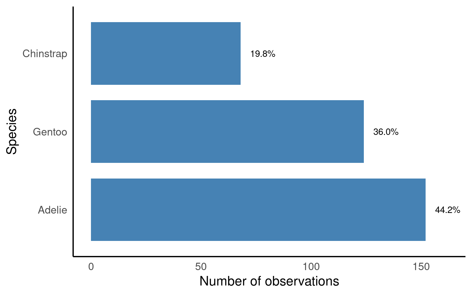
TipBig-picture
forcats::fct_relevel(): ensures bars appear in a meaningful order (Adelie → Gentoo → Chinstrap).ggplot::geom_bar(): counts penguins per species and plots as bars.ggplot::geom_text(): overlays percentage labels above each bar for clarity.ggplot::coord_flip(): makes the bar chart horizontal, which is often easier to read when labels are long.
5.5 Two or more categories
When investigating the distribution of observations, it’s important to consider how other variables might influence this relationship, such as sex, species or observations across years.
Understanding how frequency is broken down by island, species year and sex might be useful.
| island | year | species | sex | n |
|---|---|---|---|---|
| Biscoe | 2007 | Adelie | Female | 5 |
| Biscoe | 2007 | Adelie | Male | 5 |
| Biscoe | 2007 | Gentoo | Female | 16 |
| Biscoe | 2007 | Gentoo | Male | 17 |
| Biscoe | 2007 | Gentoo | NA | 1 |
| Biscoe | 2008 | Adelie | Female | 9 |
| Biscoe | 2008 | Adelie | Male | 9 |
| Biscoe | 2008 | Gentoo | Female | 22 |
| Biscoe | 2008 | Gentoo | Male | 23 |
| Biscoe | 2008 | Gentoo | NA | 1 |
| Biscoe | 2009 | Adelie | Female | 8 |
| Biscoe | 2009 | Adelie | Male | 8 |
| Biscoe | 2009 | Gentoo | Female | 20 |
| Biscoe | 2009 | Gentoo | Male | 21 |
| Biscoe | 2009 | Gentoo | NA | 3 |
| Dream | 2007 | Adelie | Female | 9 |
| Dream | 2007 | Adelie | Male | 10 |
| Dream | 2007 | Adelie | NA | 1 |
| Dream | 2007 | Chinstrap | Female | 13 |
| Dream | 2007 | Chinstrap | Male | 13 |
| Dream | 2008 | Adelie | Female | 8 |
| Dream | 2008 | Adelie | Male | 8 |
| Dream | 2008 | Chinstrap | Female | 9 |
| Dream | 2008 | Chinstrap | Male | 9 |
| Dream | 2009 | Adelie | Female | 10 |
| Dream | 2009 | Adelie | Male | 10 |
| Dream | 2009 | Chinstrap | Female | 12 |
| Dream | 2009 | Chinstrap | Male | 12 |
| Torgersen | 2007 | Adelie | Female | 8 |
| Torgersen | 2007 | Adelie | Male | 7 |
| Torgersen | 2007 | Adelie | NA | 5 |
| Torgersen | 2008 | Adelie | Female | 8 |
| Torgersen | 2008 | Adelie | Male | 8 |
| Torgersen | 2009 | Adelie | Female | 8 |
| Torgersen | 2009 | Adelie | Male | 8 |
penguins |>
  ggplot(aes(x = species,                  # x-axis = species
             fill = sex)) +               # color bars by sex
  geom_bar(width = 0.8,                     # width of the bars
           position = position_dodge()) +  # dodge bars so males/females are side by side
  labs(x = "Species",                       # x-axis label
       y = "Number of observations") +     # y-axis label
  facet_grid(island ~ year)                 # create a grid of plots: rows = island, columns = year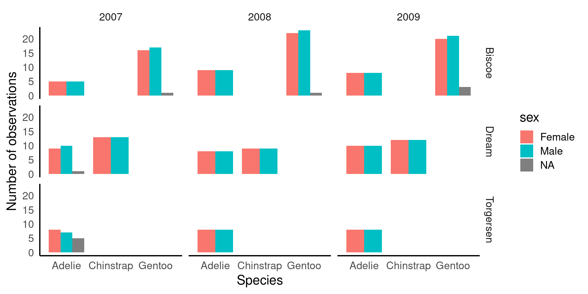
TipBig-picture
fill = sex→ bars are colored by sex, so we can compare males vs females within each species.position_dodge()→ avoids stacking bars; puts male and female bars side by side for direct comparison.facet_grid(island ~ year)→ splits the plot into a grid showing counts for each island (rows) and year (columns).This is a multi-dimensional descriptive view: you can see how species, sex, island, and year all relate to counts.
By thinking about how categories might interact, we can identify interesting patterns or potential issues that could impact our analysis or data interpretation. Careful consideration of these interactions helps us ensure the validity of our findings. For instance:
ImportantThinking about distributions
Sex Distribution: Looking at the patterns of male and female penguins, I’m reassured that the number of males and females observed is roughly equal across species and locations. This balance is important because unequal representation of sexes could bias our results, particularly in biological traits like bill length or body mass. Since there’s no imbalance, we can confidently proceed without worrying about gender skewing our insights.
Species Distribution by Island: There are different numbers of species on different islands, but this variation remains consistent across years. This suggests that the observed species distributions likely reflect true ecological patterns, rather than inconsistencies in data collection. If this trend were erratic across years, we might suspect sampling issues, but the consistency provides confidence in the accuracy of species representation.
Consistency Across Years: The number of penguins observed is consistent across years, meaning we don’t see major fluctuations in sample size. This consistency is important because significant changes could suggest variations in data collection methods or environmental factors affecting penguin populations. A steady count ensures that any trends or patterns we observe are less likely to be the result of sampling inconsistencies.
Missing Data for Sex: While there are some missing values for the sex variable, these gaps are small and don’t fit any obvious pattern. This suggests that the missing data is likely random and not linked to a particular species, location, or time period. Since the missing values are few and do not show a clear bias, we can choose to ignore these gaps in the analysis with reasonable confidence that they won’t heavily skew our results.
By reflecting on these patterns, we can be more confident in the integrity of the data and proceed with analysis, knowing that key variables are well-represented and that any missing data or inconsistencies are minimal and manageable.
5.6 Missing data
In the previous section, we identified some missing data, particularly for the sex variable, and noted that it was relatively small and likely random, meaning we could safely remove it from calculations without concern for biasA systematic error or distortion in data collection or analysis that leads to inaccurate conclusions or results. . However, when it comes to our variables of interest, such as culmen length and culmen depth, it’s worth taking a closer look at the missing values to understand if they occur in any particular patterns or groupings.
We previously used functions like skimr::skim() and summary() to find that there are two missing values each for culmen length and depth. Although this small amount of missing data is unlikely to introduce significant bias, it’s still a good practice to investigate where these missing values are located in the dataset. Identifying patterns or specific groups (e.g., certain species or islands) associated with the missing values can help ensure that the missing data is not clustered in a way that could subtly affect our analysis.
penguins |>
  # Filter rows where culmen length is NA
  filter(is.na(culmen_length_mm)) |>
  # Group by species, sex and island
  group_by(species, sex, year, island) |>
  summarise(n_missing = n())

penguins |>
  filter(is.na(culmen_depth_mm)) |>
  group_by(species, sex, year, island) |>
summarise(n_missing = n()) | species | sex | year | island | n_missing |
|---|---|---|---|---|
| Adelie | NA | 2007 | Torgersen | 1 |
| Gentoo | NA | 2009 | Biscoe | 1 |
| species | sex | year | island | n_missing |
|---|---|---|---|---|
| Adelie | NA | 2007 | Torgersen | 1 |
| Gentoo | NA | 2009 | Biscoe | 1 |
There is data missing from one Adelie penguin in 2007 on Torgersen, and one value missing from a Gentoo penguin in 2009 on Biscoe. This is true for both culmen length and depth, it is probably the same penguin in both cases, but how could we change our code to be sure?
penguins |>
  filter(is.na(culmen_length_mm)) |>
# ADD individual id into group_by arguments
  group_by(species, sex, year, island, individual_id) |>
  summarise(n_missing = n())

penguins |>
  filter(is.na(culmen_depth_mm)) |>
  group_by(species, sex, year, island, individual_id) |>
summarise(n_missing = n()) | species | sex | year | island | individual_id | n_missing |
|---|---|---|---|---|---|
| Adelie | NA | 2007 | Torgersen | N2A2 | 1 |
| Gentoo | NA | 2009 | Biscoe | N38A2 | 1 |
| species | sex | year | island | individual_id | n_missing |
|---|---|---|---|---|---|
| Adelie | NA | 2007 | Torgersen | N2A2 | 1 |
| Gentoo | NA | 2009 | Biscoe | N38A2 | 1 |
5.6.1 Handling missing values
Three main strategies:
Drop all rows with any NA (
drop_na()): simple but can remove lots - the nuclear optionDrop NAs in specific columns only.
Keep rows, use
na.rm = TRUEinside summary functions (least destructive).
5.6.1.1 drop_na() on everything before we start.
Using drop_na() to remove rows that contain any missing values across all variables can be useful, but it also runs the risk of losing a large portion of the data.
Pros: It’s a simple, all-in-one solution for datasets where missing values are widespread and problematic.
Cons: This method may remove entire rows of data, even if the missing value is only in a single, unimportant column. This can lead to significant data loss if many rows have missing values in non-critical variables.
5.6.1.2 drop_na() on a particular variable.
Another approach is to remove rows with missing data in a specific variable, such as body_mass_g. This is less drastic but still needs to be done thoughtfully, especially if you overwrite the original dataset with the modified version. It’s often better to drop NAs temporarily for specific analyses or calculations.
Pros: You retain more data because you only remove rows with missing values in the column that matters for your current analysis.
Cons: You might still lose useful information from other columns. If you overwrite the dataset permanently (e.g., using
penguins <- penguins |> drop_na(body_mass_g)), you can’t recover the dropped rows without reloading the data.
5.6.1.3 Use arguments inside functions
A more cautious approach is to handle missing data within summary or calculation functions, using the na.rm = TRUE argument. Many summary functions (like mean(), median(), or sum()) include this argument, which, when set to TRUE, excludes NA values from the calculation. This allows you to keep missing values in the dataset but ignore them only when performing calculations.
Pros: This is the least destructive option because it allows you to handle missing data without removing any rows from the dataset. You only exclude
NAvalues during specific calculations.Cons: This doesn’t remove missing data, so you need to ensure that they won’t cause issues later in other analyses (e.g., regressions or visualizations).
5.7 Continuous distributions
Important
In the examples below, adapt code to examine BOTH culmen length and culmen depth.
A continuous variable is a type of numerical variable that can take an infinite number of values within a given range. Unlike categorical variables, which represent distinct groups or categories, continuous variables can represent quantities that can be measured with fine precision. Examples include height, weight, temperature, or in the case of the Palmer Penguins dataset, culmen length and culmen depth.
5.7.1 Histograms
This is the script to plot a frequency distribution, we only specify an x variable, because we intend to plot a histogramA graphical representation of the distribution of a dataset by grouping data into bins and showing the frequency of observations within each bin. , and the y variable is always the count of observations. Here we ask the data to be presented in 10 equally sized bins of data. In this case chopping the x axis range into 10 equal parts and counting the number of observations that fall within each one.
Histograms are helpful because they show the distribution of a single numerical variable. They divide the data into “bins” (ranges of values) and count how many data points fall into each bin. This helps you:
See the shape of the data: You can easily spot if the data is normally distributed, skewed, or has multiple peaks (modes). Identify data spread: Histograms help you understand the spread or range of your data values. Detect outliers: Unusually high or low values become more noticeable in a histogram.
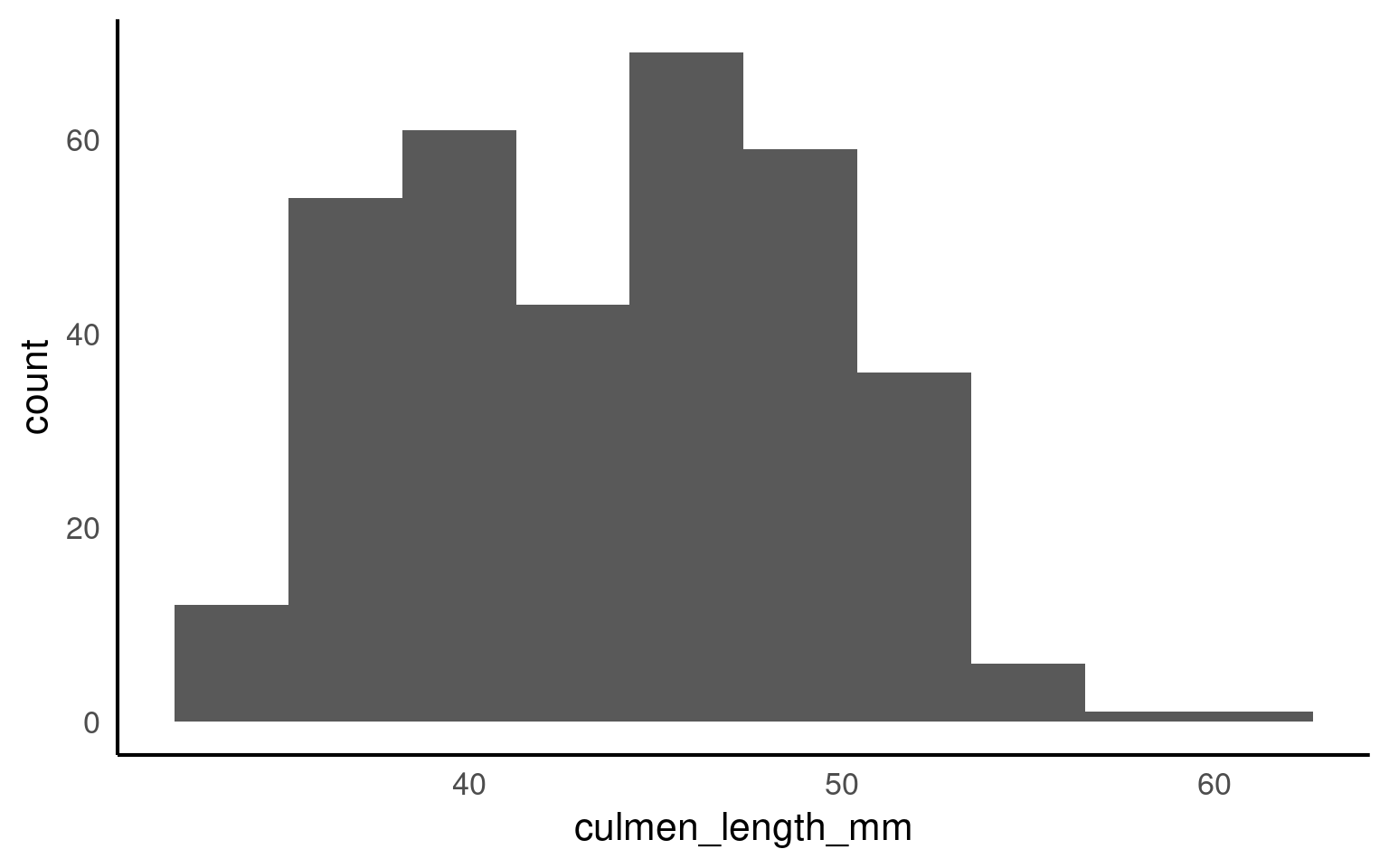
TipChange the bin argument
Try different bins values (e.g. 8, 15, 25) and observe changes.
It’s usually a very good idea to see how the use of different numbers of data “bins” changes our understanding of the distribution
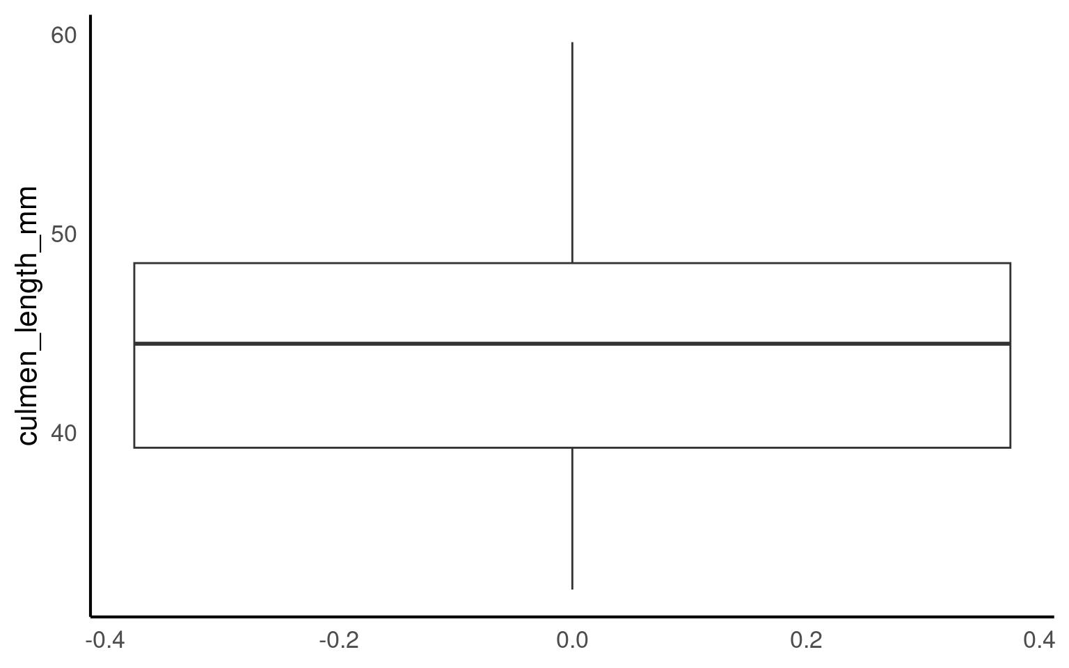
5.7.2 Boxplots
A boxplotA compact visual summary of a datasets distribution, showing the median, interquartile range (IQR), and outliers. is a powerful tool for visualizing the distribution of a numerical variable in a compact and easy-to-read format. They provide a wealth of information about the data, including its central tendency, spread, and presence of outliers, while also allowing for comparisons across different groups. Here’s why boxplots are particularly useful:
Central Tendency: The middle line within the box represents the median value of the data. Unlike the mean, which can be influenced by extreme values, the median provides a robust measure of central tendency, especially for skewed data.
Spread and Variability: The box itself shows the interquartile range (IQR), which represents the spread of the middle 50% of the data. A wider box means more variability in the data, while a narrower box indicates that the data is more tightly clustered around the median.
Outliers: Boxplots are particularly useful for identifying outliersData points that are significantly different from the rest of the dataset, often lying far from the median or mean. — data points that fall far outside the typical range of values. These are shown as individual points beyond the “whiskers” (the lines extending from the box), making it easy to spot extreme values that could affect your analysis.
Comparison Between Groups: One of the greatest strengths of boxplots is their ability to compare distributions across different groups. By plotting multiple boxplots side by side (e.g., for different penguin species), you can easily see how a variable’s distribution changes between categories, helping to highlight differences or similarities between groups.
5.8 Continuous and categorical
When you have a continuous variable (like culmen length) and want to explore how its distribution varies across a categorical variable (like species), visualizing the data is the best place to start. Simple figures allow us to easily see potential patterns and relationships between the variables.
To investigate how culmen length varies between different penguin species, we can create a simple boxplot that shows the distribution of culmen lengths for each species. This will help us quickly understand whether the different species tend to have different culmen lengths and whether any species has more variability or outliers than others.
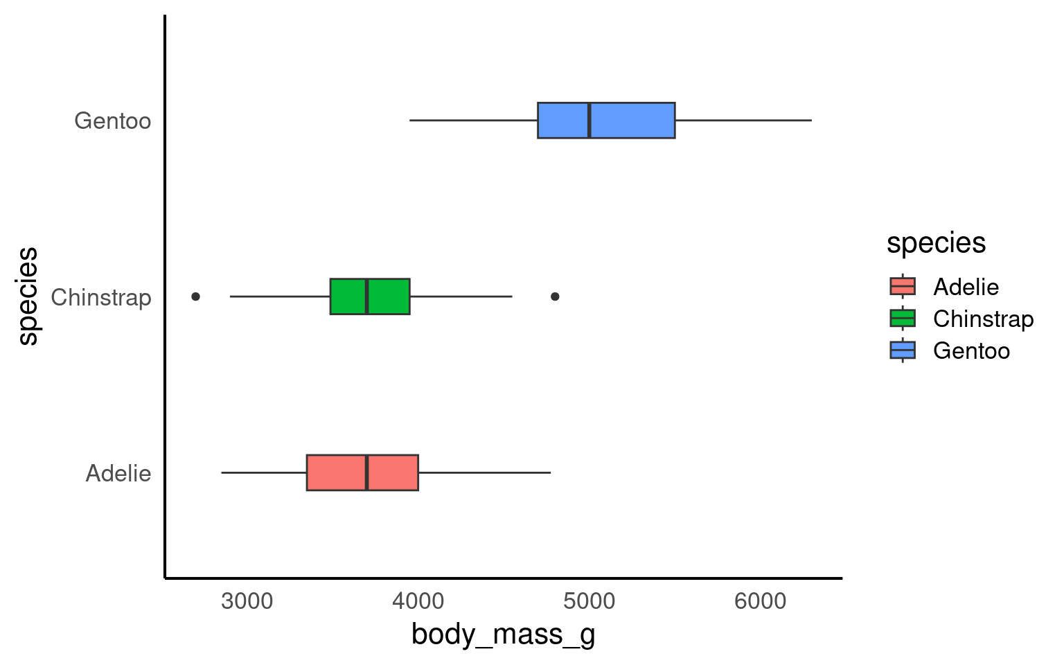
By subgrouping the data, such as looking at the distribution of culmen length by species, we can more easily identify outliers within each group. When we analyze all penguins together, outliers might be harder to spot or might seem more extreme. However, when we break the data down by species, we can see that what might have appeared as an outlier in the overall data may actually be a typical value within a specific group.
This shows us that outliers are context-specific. A value that is unusually large or small for one species might fall well within the normal range for another species. Subgrouping helps us understand that outliers are not absolute—they depend on the context of the data and the groups being compared. This insight is crucial for accurate analysis, as it helps us avoid labeling a data point as unusual without considering its appropriate context.
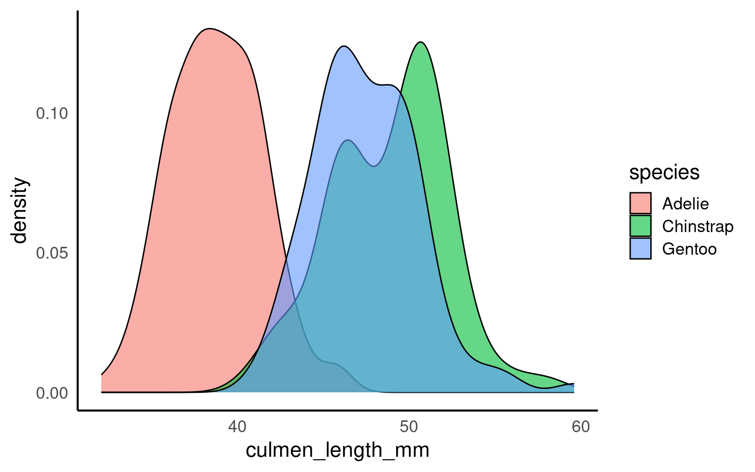
5.8.1 Density plots
Histograms and density plotsA density plot is a visualization of the distribution of a continuous numerical variable, acting as a smoothed, continuous version of a histogram. It uses a mathematical technique called kernel density estimation to draw a smooth curve that estimates the probability distribution of the data, making it easier to see the underlying shape and overall pattern compared to a histogram are both useful tools for visualizing the distribution of a continuous variable, but they present the information in slightly different ways.
Histograms divide the data into bins and count how many data points fall into each bin. This gives a blocky visual representation of the data’s distribution and is great for showing the frequency of data points within specific ranges. The choice of bin width can influence how smooth or rough the histogram looks, and it provides an easy way to understand how the data is spread out.
Density plots, on the other hand, provide a smoothed estimate of the data distribution. Instead of counting data points in bins, a density plot estimates the probability density of the variable, giving a continuous curve that helps visualize the shape of the data. The area under the curve of a density plot sums to 1, making it particularly useful when comparing distributions between groups, as it normalizes the data regardless of sample size.
5.8.2 Ridgeline density plots
The package ggridges Wilke (2024) provides some excellent extra geoms to supplement ggplot ggridges::geom_density_ridges(). One of its most useful features is to to allow different groups to be mapped to the y axis, so that histograms are more easily viewed.
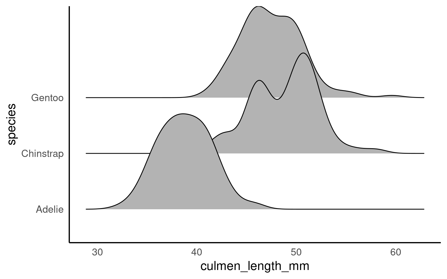
When a density plot shows double peaks (also known as bimodal distribution), it often suggests that the data may contain two distinct groups or underlying patterns that are not immediately visible. In such cases, subgrouping the data can help clarify these peaks. By breaking the data down into categories—such as species, gender, or location—we can explore whether the peaks correspond to meaningful subgroups within the dataset.
For example, in the Palmer Penguins dataset, a bimodal distribution of bill length might indicate that different species have distinct bill lengths, each contributing to one of the peaks. Subgrouping by species would allow us to visualize separate distributions for each species and better understand the source of the variation.
Subgrouping helps us gain clarity by revealing if the apparent double peaks are caused by the presence of multiple groups, and it allows us to analyze these groups separately, leading to more accurate insights.
Let’s see what happens when we account for sex:
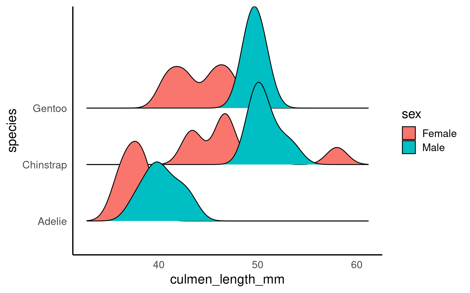
If we still see double peaks after subgrouping the data, it suggests that there may be additional underlying factors or patterns within each subgroup that we haven’t accounted for yet. These could be caused by other variables such as age, environmental conditions, or even measurement error, depending on the context of the data.
5.9 Normality
If our data follows a normal distributionAlso known as the “Gaussian distribution,” it is a probability distribution that is symmetric about the mean, showing that data near the mean are more frequent in occurrence than data far from the mean. , we can use just two key metrics — mean and standard deviation — to predict how the data is spread out and to calculate the probability of observing a specific value. The normal distribution is symmetric and bell-shaped, meaning most data points cluster around the mean, with fewer observations the farther we move from it.
5.9.1 Why These Measures Matter:
The meanThe average of a dataset, calculated by summing all values and dividing by the number of observations. gives us a general idea of the “average” value, but the standard deviationA measure of the amount of variation or spread in a dataset, indicating how far data points are from the mean on average. tells us how reliable that mean is by showing how much the data varies around it.
Together, these two metrics help us understand the overall distribution of a continuous variable. For normally distributed data, roughly 68% of values lie within one standard deviation of the mean, which provides a good sense of the data’s spread.
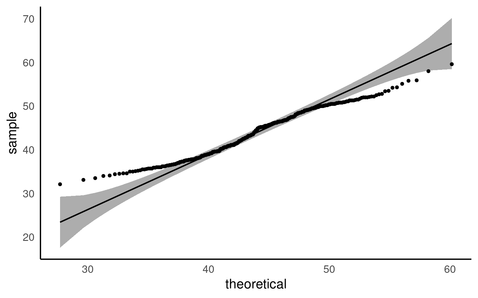
5.9.2 QQplots
A QQ plot is a useful tool for visually assessing whether a dataset follows a particular distribution, such as the normal distribution. At first glance, QQ plots may look unfamiliar, but they are simple and powerful once you understand the concept.
In a QQ plot, your sample data is plotted on the y-axis, and the theoretical distribution (often a normal distribution) is plotted on the x-axis. If your data follows a normal distribution, the points in the QQ plot will align along a straight diagonal line. Any deviation from this line indicates that your data departs from the normal distribution, either through skewness, heavy tails, or other irregularities.
How It Works:
Data Points on the Y-Axis: These are the actual data values from your sample.
Theoretical Distribution on the X-Axis: These represent what the data would look like if it perfectly followed a normal distribution.
If the data aligns well with the theoretical distribution, it forms a straight line. If not, the data will curve away from the line, signaling potential departures from normality.
Watch this video to see QQ plots explained in action and how they help in assessing the distribution of your data!
5.9.3 Shapiro test
The Shapiro-Wilk test is a commonly used statistical test to check whether a dataset follows a normal distribution. It gives a p-value that helps determine if the data significantly deviates from normality. While useful, the Shapiro test has its limitations, especially when it comes to sample size
WarningSensitivity to Sample Size:
The Shapiro-Wilk test is sensitive to sample size. For large samples (> 50), even small deviations from normality can result in significant p-values, leading to a rejection of normality even when the deviations are minor and practically insignificant.
| variable | statistic | p |
|---|---|---|
| culmen_length_mm | 0.9748548 | 1.12e-05 |
Unlike the Shapiro-Wilk test, a QQ plot provides a visual way to check for normality. It allows you to see exactly how the data deviates from a normal distribution. You can spot patterns such as skewness or heavy tails, which the Shapiro test cannot differentiate.
QQ plots are also more flexible with sample size. They work well with both large and small datasets.
5.9.4 Normality in subgroups
When you analyse the entire dataset as a whole, you are combining different groups—for example, species, locations, or treatments—each of which may have its own distribution. In the Palmer Penguins dataset, bill length and bill depth can differ substantially between species. Testing for normality across the full dataset mixes these distributions, which can give misleading results: you might incorrectly conclude the data are non-normal, or you might miss deviations that exist within individual groups.
By subgrouping, you can test normality within each group separately. This helps you see whether deviations from normality are common across all groups or specific to certain subgroups, giving a more accurate and interpretable picture of your data.
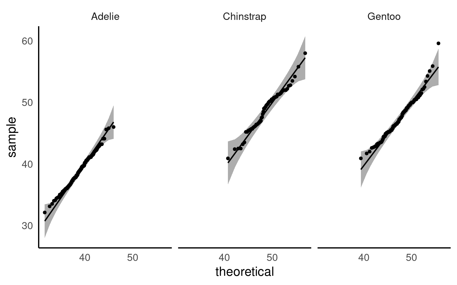
| species | variable | statistic | p |
|---|---|---|---|
| Adelie | culmen_length_mm | 0.9933618 | 0.7166005 |
| Chinstrap | culmen_length_mm | 0.9752496 | 0.1940926 |
| Gentoo | culmen_length_mm | 0.9727224 | 0.0134914 |
Now we can see that when splitting into species subgroups - that the qqplots are much better. The Shapiro wilk test indicates that the Gentoo population deviates from a normal distribution for bill length, but our qqplot indicates this is very minor and we can still safely use descriptive statistics of mean and standard deviation that rely on this assumption.
5.10 Correlation
A common measure of association between two numerical variables is the correlation coefficient. The correlation metric is a numerical measure of the strength of an association
There are several measures of correlation including:
Pearson’s correlation coefficient : good for describing linear associations
Spearman’s rank correlation coefficient: a rank ordered correlation - good for when the correlation may not be linear, or the data is not normally distributed.
Pearson’s correlation coefficient r is designed to measure the strength of a linear (straight line) association. Pearson’s takes a value between -1 and 1.
A value of 0 means there is no linear association between the variables
A value of 1 means there is a perfect positive association between the variables
A value of -1 means there is a perfect negative association between the variables
A perfect association is one where we can predict the value of one variable with complete accuracy, just by knowing the value of the other variable.
We can use the rstatix::cor_test() function in R to calculate Pearson’s correlation coefficient.
| var1 | var2 | cor | statistic | p | conf.low | conf.high | method |
|---|---|---|---|---|---|---|---|
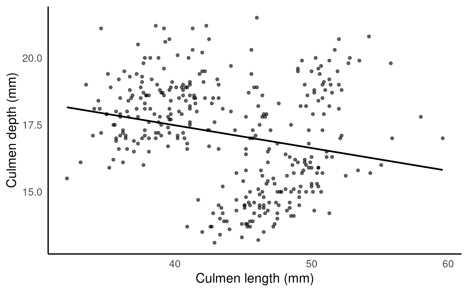
| culmen_length_mm | culmen_depth_mm | -0.24 | -4.459093 | 1.12e-05 | -0.3328072 | -0.1323004 | Pearson |
This tells us two features of the association. It’s sign and magnitude. The coefficient is negative, so as bill length increases, bill depth decreases. The value -0.24 indicates a weak negative relationship.
Because Pearson’s coefficient is designed to summarise the strength of a linear relationship, this can be misleading if the relationship is not linear e.g. curved or humped. This is why it’s always a good idea to plot the relationship first (see above).
Even when the relationship is linear, it doesn’t tell us anything about the steepness of the association (see above). It only tells us how often a change in one variable can predict the change in the other not the value of that change.
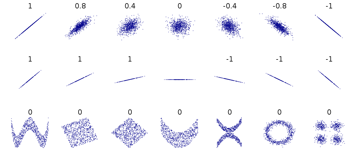
This can be difficult to understand at first, so carefully consider the figure above.
The first row above shows differing levels of the strength of association. If we drew a perfect straight line between two variables, how closely do the data points fit around this line.
The second row shows a series of perfect linear relationships. We can accurately predict the value of one variable just by knowing the value of the other variable, but the steepness of the relationship in each example is very different. This is important because it means a perfect association can still have a small effect.
The third row shows a series of associations where there is clearly a relationship between the two variables, but it is also not linear so would be inappropriate for a Pearson’s correlation.
5.10.1 Spearman’s rank correlation
ImportantIf the data is not correlated in a straight line (linear), or doesn’t have a normal distribution we should use Spearman’s over Pearson’s
Instead of working with the raw values of our two variables we can use rank ordering instead. The idea is pretty simple if we start with the lowest value in a variable and order it as ‘1’, then assign labels ‘2’, ‘3’ etc. as we ascend in rank order.
| var1 | var2 | cor | statistic | p | method |
|---|---|---|---|---|---|
| culmen_length_mm | culmen_depth_mm | -0.22 | 8145268 | 3.51e-05 | Spearman |
You can see that we get a similar but not identical estimate of the strength of association. Generally non-parametric tests are less powerful, but have fewer assumptions about the structure of our data.
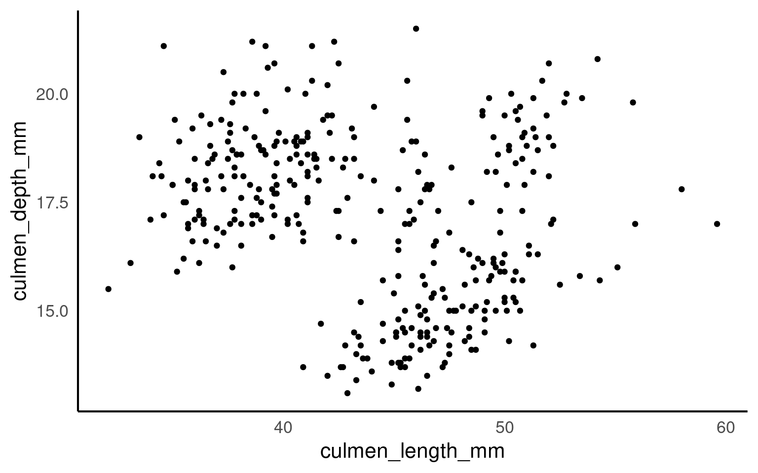
5.10.2 Scatterplots
Correlation coefficients are a quick and simple way to attach a metric to the level of association between two variables. They are limited however in that a single number can never capture the every aspect of their relationship. This is why we visualise our data, and the best way to do that for two continuous variables is to make a scatterplot
5.10.2.1 Marginal plots
Marginal plots are useful when you want to explore the distribution of individual variables alongside a scatterplot of the relationship between two variables. They add histograms, density plots, or boxplots to the margins of a scatterplot, providing extra information about the distribution of each variable separately. So we would could add any of the plots we used previously to look at variance in each of our variables culmen_length_mm and culmen_depth_mm
5.10.2.2 How to Create Marginal Plots: Using patchwork in R
patchwork Pedersen (2024) is an R package that makes it easy to combine multiple ggplots into a single plot layout, including creating layouts for marginal plots. While ggplot2 doesn’t natively support marginal plots, patchwork allows you to combine the scatterplot with additional histograms or density plots at the top and side, creating a custom marginal plot.
library(patchwork) # package calls should be placed at the TOP of your script

bill_depth_marginal <- penguins |>
  ggplot()+
  geom_density(aes(x=culmen_depth_mm), fill="darkgrey")+
  theme_void()+
  coord_flip() # this graph needs to be rotated

bill_length_marginal <- penguins |>
  ggplot()+
  geom_density(aes(x=culmen_length_mm), fill="darkgrey")+
  theme_void()

layout <- "
AA#
BBC
BBC"

# layout is easiest to organise using a text distribution, where ABC equal the three plots in order, and the grid is how much space they take up. We could easily make the main plot bigger and marginals smaller with

scatterplot <- scatterplot +
  geom_smooth(method = "lm",
              se = FALSE)

bill_length_marginal+
  scatterplot+
  bill_depth_marginal+
  # order of plots is important
plot_layout(design=layout) 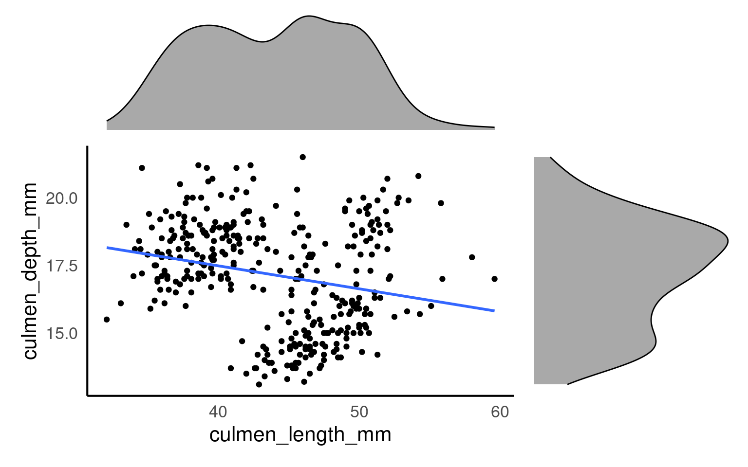
From this plot we would conclude that there is weak relationship between culmen length and culmen depth.
5.10.3 GGally
The R package GGally Schloerke et al. (2024) helps us understand the relationships between variables, by producing a pairwise matrix grid made of:
Scatterplots: The scatterplots in a pairwise matrix (created by
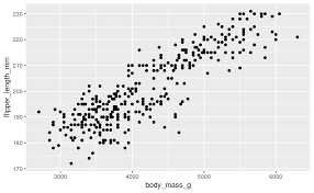
GGally::ggpairs()) allow you to visually inspect the relationship between pairs of continuous variables. If two variables show a strong linear relationship (points forming a clear diagonal line), it suggests collinearity between those variables.Correlation Coefficients: In the pairwise matrix, you can also display correlation coefficients. When these values are close to 1 (positive correlation) or -1 (negative correlation), it suggests that the variables are highly correlated and might indicate collinearity.
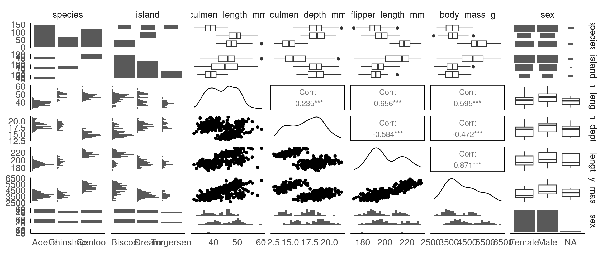
From these pairwise plots we can see that there is a correlation between flipper length, body mass and the culmen length and depth variables. This is useful information to know when considering the relationship between variables for cause and effect, and will be important when build statistical models.
ImportantApplying Subgroups in GGally
Since GGally builds on ggplot2, you can apply the same customisations that ggplot2 allows, including the use of color to represent different subgroups in your data. This is especially useful when exploring relationships between variables, as it helps highlight patterns or differences between categories (e.g., species, sex, or location).
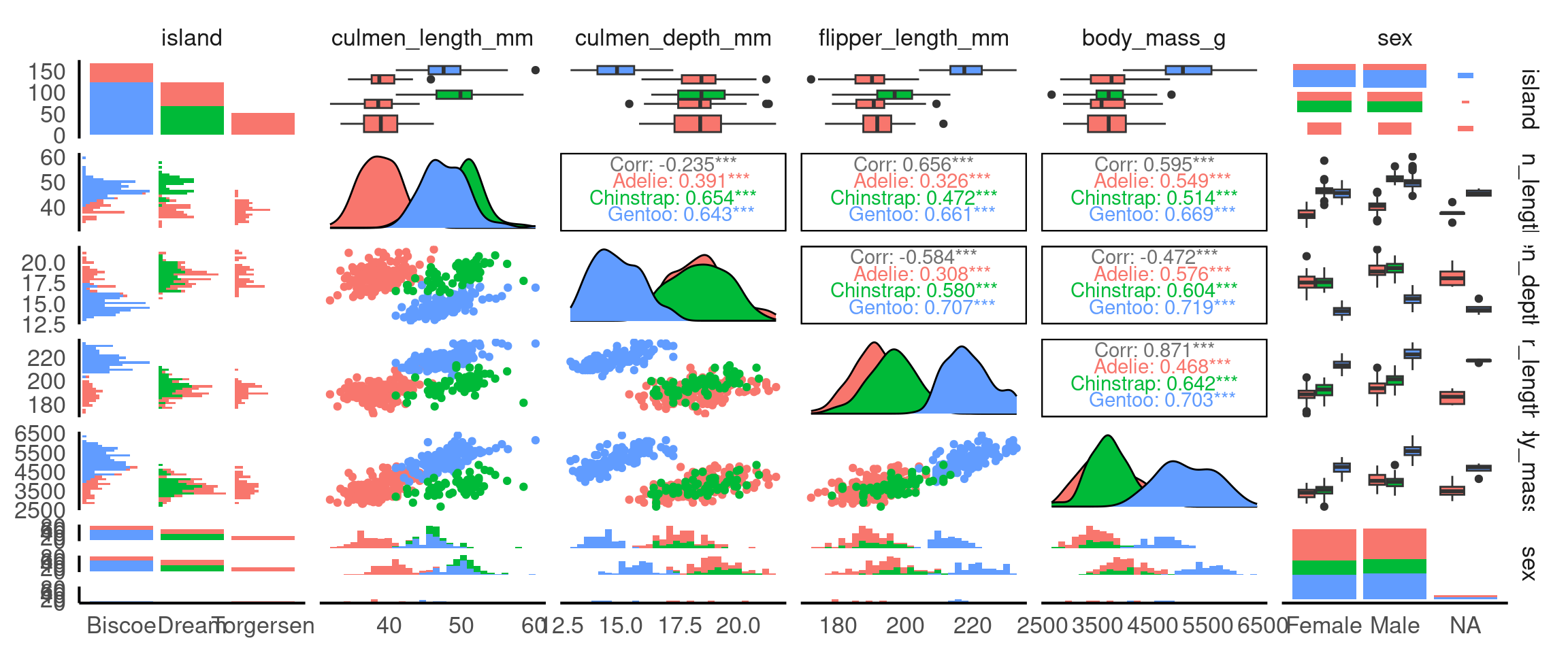
Why is this useful? It means we can identify group-specific trends: Adding colour based on a categorical variable (like species) helps you quickly spot trends or patterns that may exist only within certain groups.
5.11 Thinking Causally: Interpreting Relationships Carefully
So far we have described patterns (distribution, correlation). Causal thinking adds one disciplined question:
Could another variable explain, mask, change, or reverse the relationship we see between two variables?
We will NOT “prove” causation here. Instead we (a) name the main structures that can mislead, and (b) practice simple checks.
5.11.1 Core Terms
| Term | Meaning | Penguin example |
|---|---|---|
| Association | Two variables vary together | Culmen length & culmen depth correlate |
| Confounder | Variable that influences both variables of interest, creating a misleading pooled pattern | Species affects both length and depth |
| Omitted variable bias | Distortion in a relationship caused by leaving out a confounder | Ignoring species when correlating length & depth |
| Effect modifier/moderator (interaction) | A variable that changes the strength or slope of a relationship | sex might change the slope of length→depth (if slopes differ) |
| Simpson’s paradox | Pooled trend weakens/reverses after stratifying by a confounder | Pooled weak/negative vs within‑species positive |
| Adjustment / Stratification | Looking within levels (or controlling for) a variable (e.g. species) | Facet by species |
| DAG (Directed Acrylic Graph) | A simple arrow diagram of assumptions | species → length; species → depth; length → depth (?) |
5.11.2 Example DAG
We hypothesise that:
species → culmen_length_mm
species → culmen_depth_mm
sex → culmen_depth_mm   (maybe sex → culmen_length_mm)
culmen_length_mm → culmen_depth_mm ?   (relationship we are exploring)
Interpretation: - Species is a confounder of length–depth as it can affect both directly - Sex might weakly confound or modify (check visually). - We “adjust” by stratifying (faceting, colouring etc.) or adding grouping to summaries.
5.11.3 Checklist Before Interpreting a Scatterplot
- Are there obvious grouping variables that should have been included? (species, sex, island)
- Does the pooled relationship differ visually from within-group lines?
- Do group slopes look similar (association consistent) or different (effect modification)?
- Did missing values drop particular groups (re-check small
n)? - After splitting by groups, does the direction/strength change (Simpson’s paradox)?
5.11.3.1 Activity: Revisit the Pooled Plot
(You likely have this already—repeat quickly.)
Question: Is the pooled slope clearly positive, clearly negative, or weak/ambiguous?
5.11.3.2 Activity: Split by Species (Confounding Check)
colours <- c("cyan",
             "darkorange",
             "purple")

scatterplot_2 <- ggplot(penguins, aes(x= culmen_length_mm,
                     y= culmen_depth_mm,
                     colour=species)) +
    geom_point()+
  geom_smooth(method="lm",
              se=FALSE)+
  scale_colour_manual(values=colours)+
  theme_classic()+
  theme(legend.position="none")+
    labs(x="Bill length (mm)",
         y="Bill depth (mm)")

bill_depth_marginal_2 <- penguins |>
  ggplot()+
  geom_density(aes(x=culmen_depth_mm,
                   fill=species),
               alpha=0.5)+
  scale_fill_manual(values=colours)+
  theme_void()+
  coord_flip() # this graph needs to be rotated

bill_length_marginal_2 <- penguins |>
  ggplot()+
  geom_density(aes(x=culmen_length_mm,
                   fill=species),
               alpha=0.5)+
  scale_fill_manual(values=colours)+
  theme_void()+
  theme(legend.position="none")

layout2 <- "
AAA#
BBBC
BBBC
BBBC"

bill_length_marginal_2+scatterplot_2+bill_depth_marginal_2+ # order of plots is important
  plot_layout(design=layout2) # uses the layout argument defined above to arrange the size and position of plots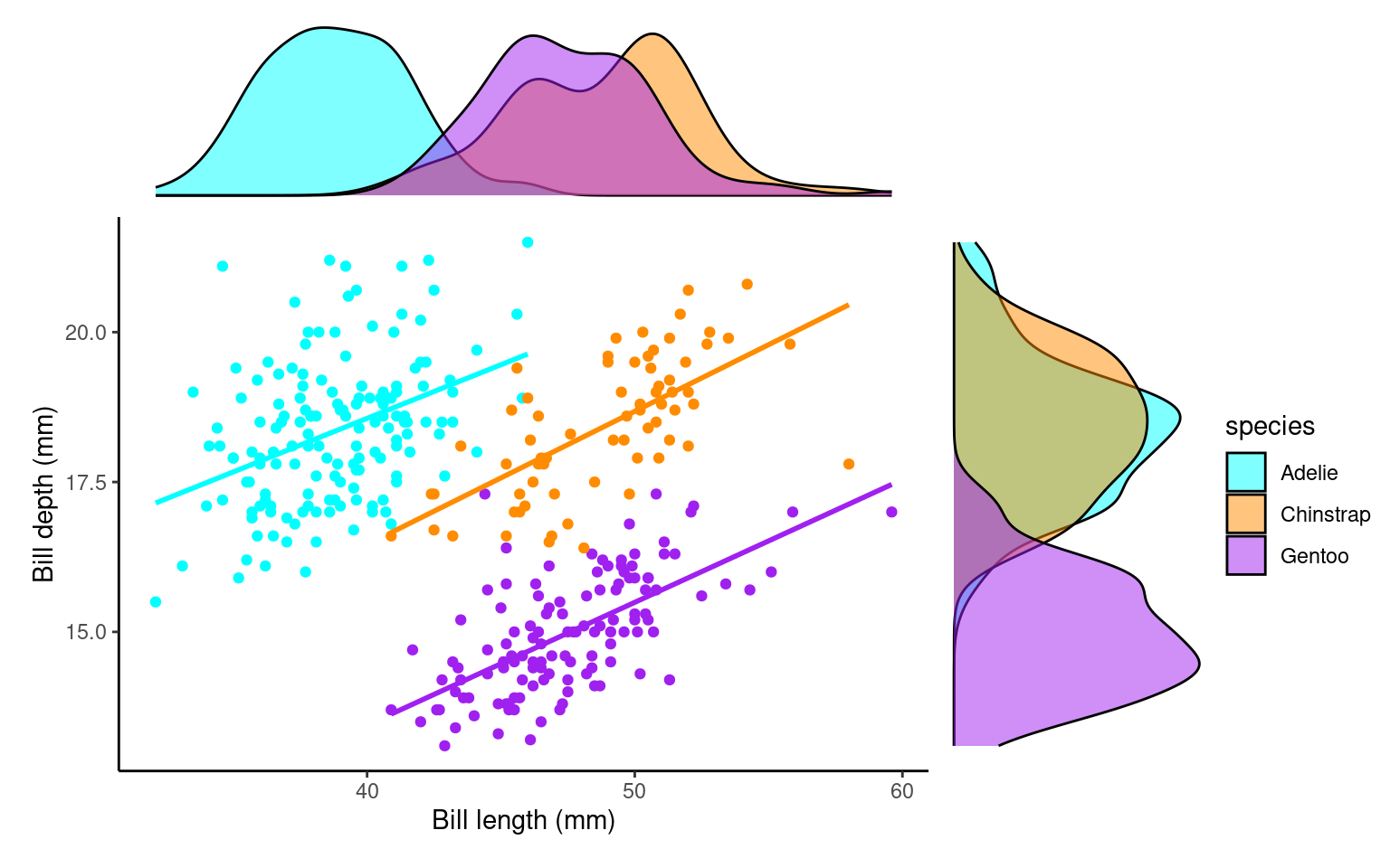
Task:
Visually compare each species’ slope to the pooled one.
If pooled and within-species slopes differ in sign or strength, species is a confounder (Simpson’s paradox manifested).
Species IS a confounder
5.11.3.3 Activity: Add Sex as a Potential Effect Modifier
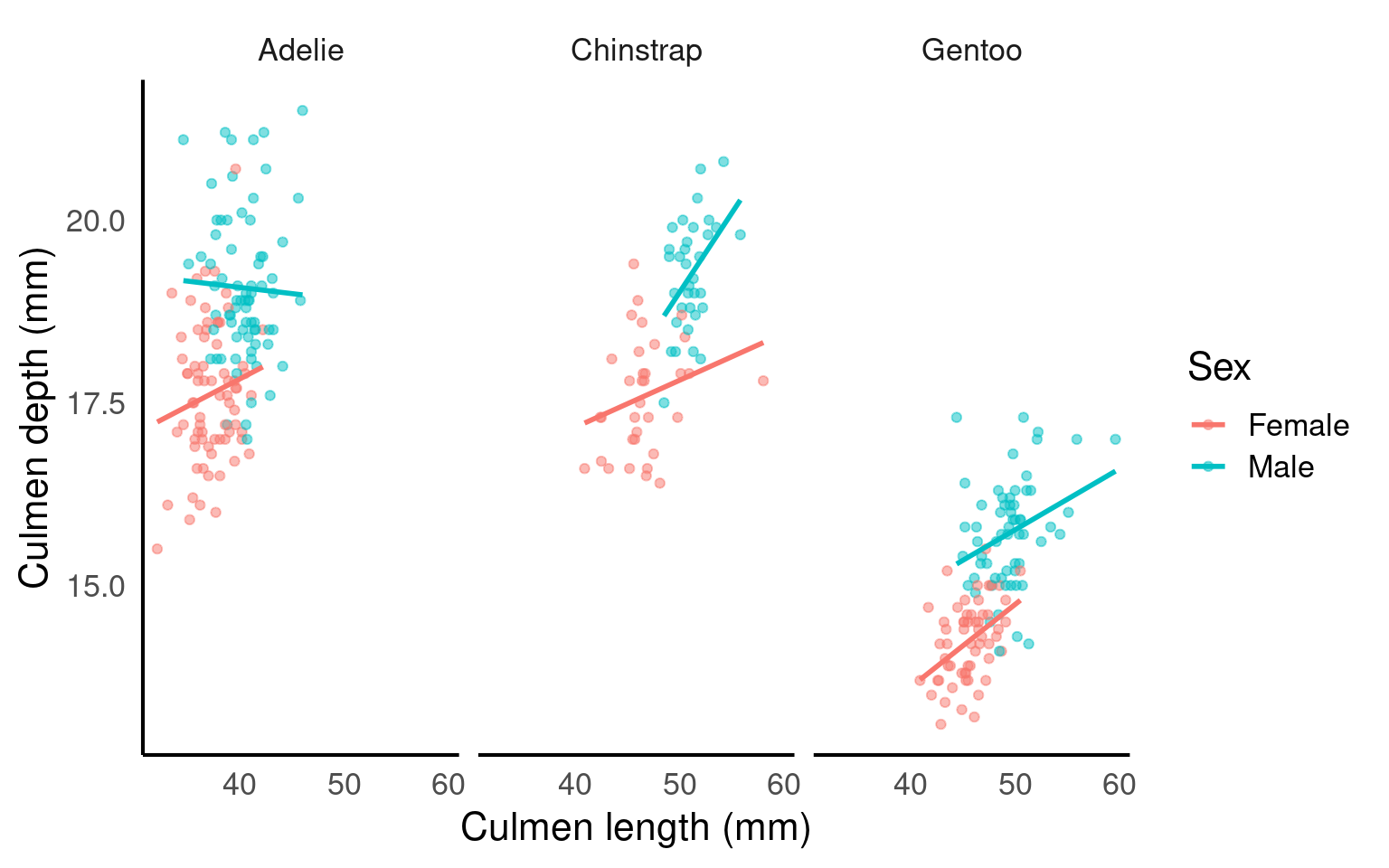
Task:
-
Do male vs female slopes within the same species look meaningfully different?
If yes, sex may be an effect modifier.
If not, treat sex mainly as a potential (minor) confounder or even ignore for this relationship.
5.11.4 Interpretation Templates
Pick one that matches what you observe:
Confounding only:
“Species confounds the culmen length–depth relationship: pooled association was weak, but each species shows a clear positive trend.”Confounding + minor effect modification:
“Species confounds and slightly modifies the relationship: all species show positive slopes, but varies by species.”No strong modification:
“After adjusting for species, the length–depth association is unchanged, suggesting little effect modification by species.”Sex modifies (if evident):
“Within species, male and female slopes differ, indicating sex may also modify the length–depth relationship.”
5.11.5 Rapid Reflection (Write 1–2 Sentences Each)
- Which variable had the strongest confounding impact? Why?
- Did any variable change (modify) slope shape, or did it only shift intercepts (starting points)?
- Which additional variable would you next test and why (island, year, body_mass_g, flipper_length_mm)?
- Provide a final adjusted interpretation (choose or adapt a template).
Species was the key confounder: pooled slope understated the positive within-species scaling. Slopes were generally similar across sexes, so sex isn’t a confounder but could be considered a medium/strong effect modifier.
5.11.6 Causal Mini‑Summary
- Start from a pattern (association).
- Ask: “Could a third variable explain or change this pattern?” (confounder or modifier).
- Stratify or adjust.
- Compare pooled vs stratified results.
- Report the adjusted story, not the misleading pooled one.
5.12 Summary
Good exploratory analysis is more than generating a gallery of plots. Follow a clear workflow: summarise → visualise → think causally.
Summarise: Compute core descriptive statistics (counts, mean/median, sd/IQR) overall and by biologically relevant groups (species, sex).
Visualise: Use complementary plot types (histograms + density, box + violin, scatter + stratified regression lines) to uncover shape, variation, multigroup structure, and potential outliers.
Think Causally: Ask whether apparent associations (e.g. culmen length vs depth) could be explained by confounders (species) or modified by other variables (sex). Stratify early to prevent misinterpretation (Simpson’s paradox).
Along the way:
Inspect group balance (are some islands or species overrepresented?).
Handle missing data transparently (avoid silent bias from complete-case filtering).
Flag strongly correlated predictors for later modelling choices.
Distinguish “association” from a causal story; visual adjustments (colouring/faceting) are informal “adjustments.”
Use concise interpretation templates: report the adjusted relationships, not just the pooled one.
End every exploration by answering:
What changed after grouping/splitting?
Which variables mattered most?
What uncertainties remain?
A high-quality summary is a short, justified narrative linking observed patterns to biological structure—not a disconnected sequence of figures.
5.13 Glossary
| term | definition |
|---|---|
| bias | A systematic error or distortion in data collection or analysis that leads to inaccurate conclusions or results. |
| boxplot | A compact visual summary of a datasets distribution, showing the median, interquartile range (IQR), and outliers. |
| confounding variable | A variable that affects both the independent and dependent variables, potentially distorting the observed relationship between them. |
| correlation coefficient | A numerical value ranging from -1 to 1 that measures the strength and direction of the linear relationship between two variables. |
| density plots | A density plot is a visualization of the distribution of a continuous numerical variable, acting as a smoothed, continuous version of a histogram. It uses a mathematical technique called kernel density estimation to draw a smooth curve that estimates the probability distribution of the data, making it easier to see the underlying shape and overall pattern compared to a histogram |
| histogram | A graphical representation of the distribution of a dataset by grouping data into bins and showing the frequency of observations within each bin. |
| mean | The average of a dataset, calculated by summing all values and dividing by the number of observations. |
| normal distribution | Also known as the "Gaussian distribution," it is a probability distribution that is symmetric about the mean, showing that data near the mean are more frequent in occurrence than data far from the mean. |
| outliers | Data points that are significantly different from the rest of the dataset, often lying far from the median or mean. |
| scatterplots | A graph that displays the relationship between two numerical variables by plotting data points on an X and Y axis. |
| standard deviation | A measure of the amount of variation or spread in a dataset, indicating how far data points are from the mean on average. |